Company Overview Buske
Pre-Production
Concept & Scripting
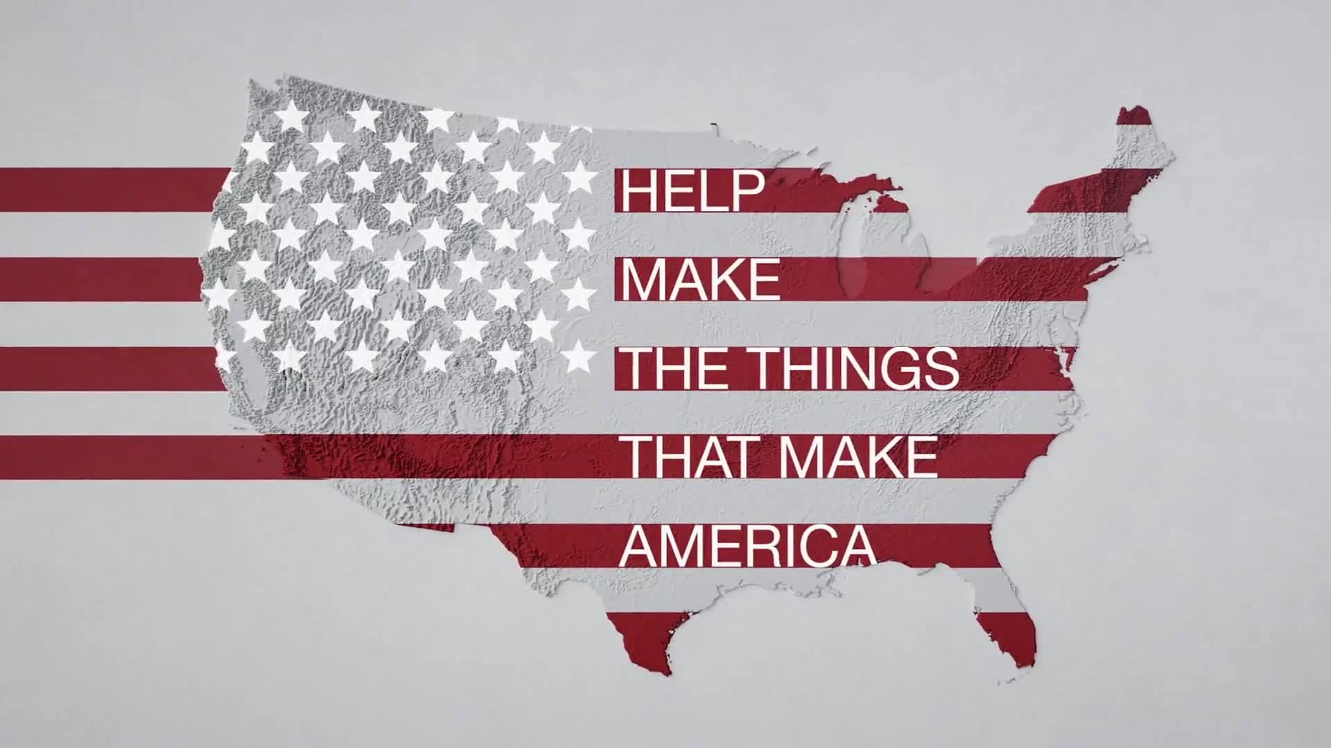
The Buske corporate video wasn’t built like a typical brand piece—it was designed as a cinematic, question-led narrative to build intrigue and establish credibility. Instead of starting with “here’s who we are,” the script opened with a rhetorical prompt: What would it take to be the best logistics company in the industry? Each visual beat served as a response to that question—stacking up operational scale, a people-first culture, and tech-forward precision until the final reveal positioned Buske as the answer.
Client collaboration began with this framing strategy. A full brand guide, vector logo, and printed brochure set the tone: streamlined, authoritative, and clean. These materials didn’t just shape design—they influenced animation tone, typography, and pacing. The client also provided drone footage of their Fort Worth facility, grounding the concept with physical reality before transitioning into a more abstract, design-driven sequence. That integration was critical: it bridged the real world to a more conceptual visualization of logistics clarity.
The brand’s internal phrase—“simple, transparent logistics”—was foundational. It shaped both the language and the look: glass-like interfaces, grid-based layouts, and modular movement systems. The goal wasn’t to mirror the real world but to visualize operational simplicity through abstraction. That guided the script’s cadence too: deliberate, spacious narration was essential to give room for metaphor-driven visuals, especially during complex data scenes like the North America map or warehouse simulation. Script revisions focused on clarity, emphasizing certifications and client legacy without slipping into promotional excess.
Rapid Prototyping
Rapid prototyping was executed in Cinema 4D with a MoGraph-heavy, modular approach. The goal was to lock in structural fundamentals: camera paths, scene sequencing, and timing. Given the repetition of forms like boxes, racks, and cylinders, Cloner objects, Effectors, and Multi-Instance rendering were leveraged to preview large-scale layouts without killing viewport performance.
For the “people” section, stock portraits were curated for diversity and professionalism, then formatted to exact aspect ratios. A Multishader randomly distributed these portraits across a 3D box grid. An Atom Array overlay added structure and a tech-forward look, tying back to the video’s core themes.
The US map scene was built from a simplified 3D vector outline populated with vertical cylinders. Delay and Step Effectors drove wave pulses across the surface—visualizing Buske’s national impact as network ripple, not geographic pinpoint. This map layout also allowed for late-stage UI layering and typography integration using Cinema 4D’s data pipeline to After Effects.
The “100 Years” scene was a high-touch technical prototype. We used a Fracture object to build the numeric form from scattered elements, synced to a macro transition. Behind it, a logo-covered box grid used a second Multishader system—offering on-brand and generic box versions to give the client options ahead of full production.
RP materials were stripped down for speed: glass objects used a simplified 50–75% transparency shader. These placeholders gave enough accuracy to communicate tone without slowing down iteration. A scratch VO track was used throughout to match scene pacing and preemptively resolve narration flow issues before final audio recording.
Early Visual Styles Explored
During RP, we explored several shader combinations to find the right tone. Early references leaned into high-tech minimalism: clean transparencies, low-saturation palettes, and white/blue highlights. The glass shader became the visual anchor—balancing light dispersion and refraction while keeping Redshift performance lean. Multiple versions were tested, with brightness, fresnel, and density controls fine-tuned to hit a luminous, crystalline look without rendering noise or opacity artifacts.
Test lighting setups varied from full three-point rigs to low-shadow HDRIs. In the end, we opted for a low-gravity visual language: no hard shadows, soft floating scenes, and deliberate use of depth-of-field to guide focus. This helped reinforce the “simulation space” feel—a clean, conceptual world focused on operational clarity rather than realism.
Styleframes and shader tests were compiled into an internal moodboard and reviewed alongside the RP. This styleboard wasn’t shared with the client directly, but it served as a fast reference system once full production began—especially helpful when refining complex scenes like the map and 100 Years montage.
Prototyping Animation Concepts
We used RP to validate animation logic in high-density systems. Cloners and Effectors were layered to animate box movement along implied tracks or through architectural frameworks. In one test, we tied color changes to spatial proximity using Shader Effectors—boxes pulsed or shifted hue based on how close they came to key elements like warehouse clusters. While this didn’t make it into RP, it laid the groundwork for polish-phase refinements.
Complex camera moves were built using spline paths and layered null systems to separate position and rotation. Scene transitions were often camera-based—minimizing cuts and helping maintain a smooth narrative flow. The RP included fully animated camera passes across all major sequences, allowing for signoff on pacing before VO was finalized. Key feedback, like slowing the map pulse or elongating the final tagline hold, was implemented directly in RP.
Client Feedback Shaping Direction
Client feedback was detailed and responsive throughout RP. Script rounds were collaborative and tracked—edits focused on tone balance: aspirational but grounded. On the visual side, client input included extending the map sequence, increasing visibility for client logos, enlarging the “100 Years” title box, and smoothing transitions between abstracted scenes.
Pacing was a recurring theme. The structure and ambition were spot-on, but the client wanted longer visual hold times for key concepts. This impacted both visual timing and VO delivery cadence.
By the end of RP, we had approval to move into full production with confidence. Shaders, camera paths, narration cadence, and the overarching metaphor structure were all greenlit. The path to final was clear: upgrade materials, refine lighting, lock VO, and layer compositing polish on a solid structural foundation.
Full Production (FP)
Look Development
The visual signature of the Buske corporate video was its custom glass shader—a material that didn’t just define the aesthetic but served as the project’s technical centerpiece. From day one, this shader needed to walk a fine line: visually rich, conceptually clear, and efficient enough to render across thousands of instanced elements without dragging down performance.
The reference point was “frozen glass”—clear but not clinical, luminous without being overpowering. It had to suggest internal structure, like a crystalline system with caustics and light breakup, while staying optically readable for both close-up and background elements. Built in Redshift, the shader used a layered node architecture starting with a dielectric base. On top, we stacked Fresnel-controlled reflectance, subtle SSS, and dispersion to split light across the surface. Caustics were applied just enough to sparkle along edges without triggering noisy artifacts or bloating render times.
Rather than a one-size-fits-all solution, this was a full shader system. We developed multiple variants depending on camera distance and scene complexity. For hero moments and close-ups, the full shader stack included refraction, caustics, and micro-anisotropy. For background elements, we stripped down to lower-opacity, simplified IOR models without volumetrics. Transparency across the system stabilized around 65%, with internal fog color shifted toward a cool brand-aligned blue. The internal glow wasn’t volumetric—it was a composite effect using low-level emission settings and Redshift’s bloom filter to simulate internal light without costly sim passes.
Dozens of render tests refined the shader’s balance. We tuned IOR values from 1.2 to 1.5, A/B tested single-ray vs. multi-ray refraction, and carefully adjusted edge softness to highlight transitions. A key optimization came from slightly thickening the object walls—boosting internal reflection fidelity while reducing hot spots and flicker. That one tweak had ripple effects throughout lighting, shading, and compositing.
Lighting wasn’t just support—it was an integral part of making the shader sing. We designed soft HDRI environments that wrapped light around the transparent forms, avoiding harsh shadows and flattening. Custom area lights were placed strategically—always off-angle—to trigger specific reflection glints that defined the glass edges. These weren’t general light setups; they were engineered per shot to hit shader contours with surgical precision.
The final Buske logo scene was built as a standalone lighting and shading system. Unlike the procedural boxes, the logo was a hero object—narratively and visually. It had to embody Buske’s promise: clean, engineered transparency at scale.
We modeled the logo with beveled edges to catch refraction highlights and give the shader room to refract and reflect light dynamically. The internal fog hue was pushed slightly colder, and we layered in a low-emission glow to make it feel as though it lit from within. Unlike the grid scenes, the environment here was purposefully darker—just enough ambient fill to define form, with one sharp directional light casting a high-contrast specular across the “B.” Rim lights added dimensional glow without washing out clarity.
In compositing, we selectively boosted bloom and chromatic aberration for this shot only—just enough to amplify detail without veering into stylization. The logo reveal became the visual exclamation point of the film: a moment of pause and clarity, conceptually distilled into a single object.
This level of visual fidelity required more than just pretty shaders—it had to work at scale. Without optimization, rendering thousands of glass elements would have overwhelmed the GPU. We addressed this early through shader tiering, instancing strategies, and lighting control.
Shader variants were deployed based on object proximity and importance. Lighting setups were scene-specific but modular, allowing us to swap out HDRIs and keylight angles without rebuilding scenes. Redshift settings were tuned to balance ray depth and reflection samples with render time. We prioritized clean edge clarity and internal light behavior, reducing unnecessary GI and optimizing AO where possible.
The result: a signature look that felt rich, clear, and premium—while staying lean and technically sharp across the board.
Design & Animation
With camera logic and narrative flow validated during RP, full production moved into animating the final-resolution scenes. MoGraph Cloners, Effectors, and Fields remained core tools throughout. In the “people” sequence, the box grid was enhanced with a digital mosaic overlay—a grid texture layered over the portraits to emphasize individuality within a system. Each portrait stayed fully visible, framed by a subtle, tech-forward structure that reinforced the conceptual theme.
In the warehouse and logistics environments, box movement was controlled with spline paths augmented by Random and Shader effectors. This allowed motion to feel organic and reactive, while still following structured logistical routes. Delay effectors with custom falloff fields introduced timed progressions—boxes near central spines moved first, triggering outward flow like a controlled domino effect.
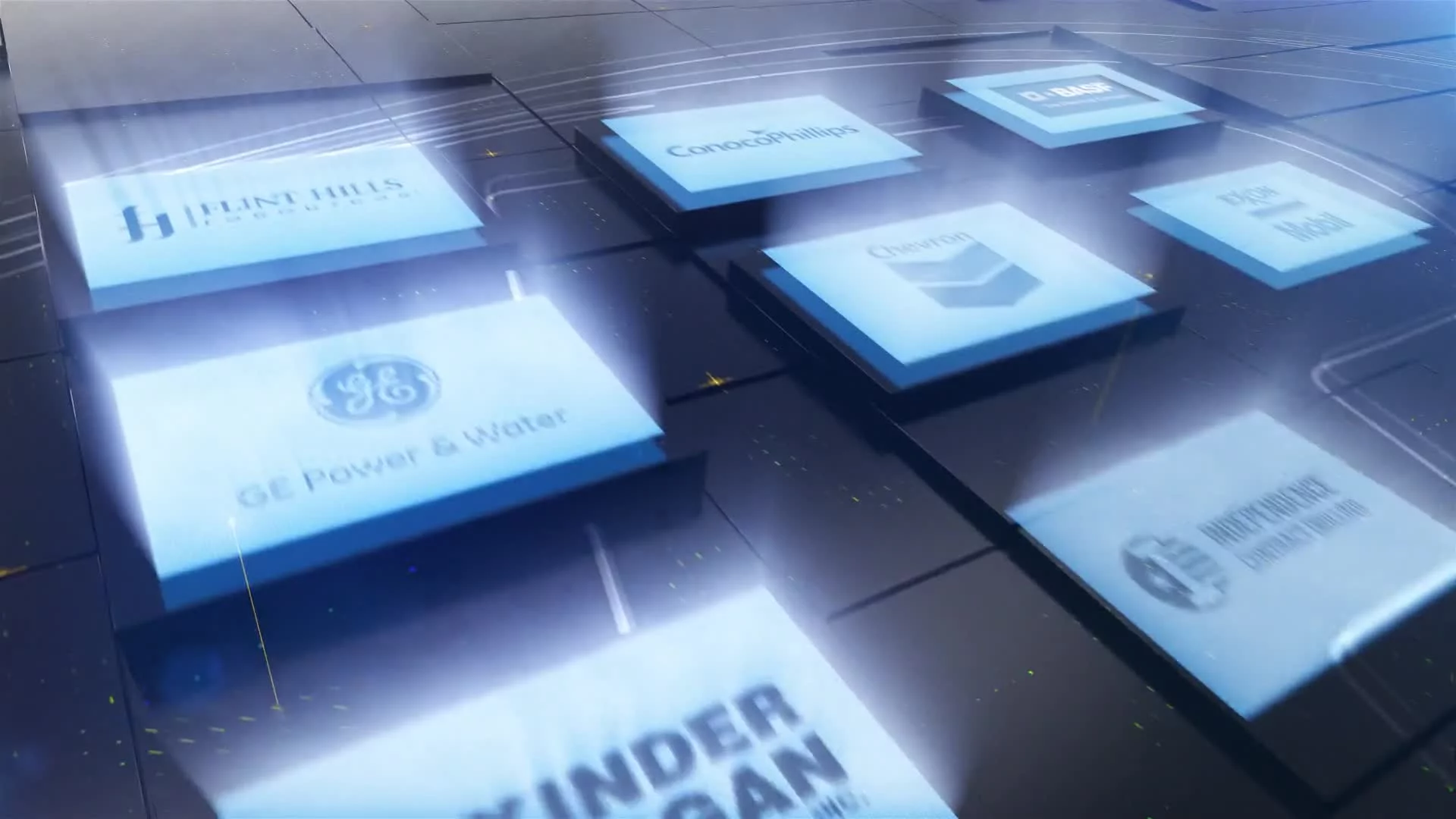
The “100 Years” animation was rebuilt using Fracture objects and MoGraph effectors with fine-tuned ease curves to ensure the number formed with measured confidence. Client logos in the background were driven by a position-based Multishader system, maintaining randomized yet legible placement. Using Redshift Takes, we exported both branded and unbranded variants—keeping geometry identical and preserving render efficiency.
Camera animation received extra attention. No shot remained static—each camera move was designed to reveal, elevate, or immerse. In the warehouse corridor sequence, a reverse dolly tracked through narrow glass walls with text fading into 3D space along the sides, placing the viewer inside the system. This move reinforced the film’s immersive logistics metaphor.
Style Choices and Reasoning
The visual strategy was rooted in controlled abstraction. We minimized surface complexity to highlight purity of form—structured, clean, weightless. This made room for subtle effects to carry meaning: internal reflections, soft glow shifts, and layered transparency cues. Scenes felt engineered and pristine, aligned with the themes of transparency, structure, and control.
Redshift was the engine of choice for balancing real-time iteration with high-fidelity rendering. It handled the procedural object counts and shader complexity without compromising AOV flexibility. Compositing was built on clean passes—Z-depth, Object ID, Material ID—to allow surgical post-production control.
Technical Details
Every sequence leveraged procedural systems. Cloner setups drove people grids, warehouse layouts, map pulses, and box groupings. Shader Effectors allowed color shifts by position—most visible in dispatch scenes where boxes transitioned from white to red as they neared departure.
Camera rigs were constructed with layered nulls—separating pan, tilt, and dolly. This enabled rack-focus precision and tight spatial control in depth-of-field heavy shots. The Stage Object in C4D handled multi-scene sequencing while maintaining global lighting consistency.
Shader structures in Redshift used node priority systems and layered materials to blend glow, transparency, and color shifts. A subtle thin-film iridescence was applied in select warehouse scenes, only visible through movement and angled light, adding another layer of depth.
Unique Animation Techniques
The map ripple animation used Delay and Step Effectors on a cloned cylinder grid. Ripples were driven procedurally - no keyframes, just dynamic propagation logic that visualized reach and scale without literal pins.
Warehouse motion used a hybrid approach: spline-driven direction with layered randomness for realism. Dynamics were avoided for predictability—this system delivered flow, logic, and total control.
Challenges and Solutions
The biggest technical lift was rendering complex glass at scale. Initial tests revealed Redshift noise and long convergence times, especially in scenes with nested transparency. We introduced per-pass denoising, optimized sample counts by scene, and created simplified shader variants for background elements.
Box-heavy scenes stressed viewport performance. We mitigated this with multi-instance objects, culling tools, and proxy previews—preserving workflow speed and animation clarity.
Post-Production & Delivery
Final Compositing & Color Grading
Post kicked off with a structured After Effects pipeline built to work cleanly with Cinema 4D’s AOV outputs. Every Redshift-rendered shot was delivered as a multilayer EXR sequence, broken down into diffuse, specular, reflection, refraction, emission, motion vector, and Z-depth passes. Cryptomatte and Object Buffers gave us precise isolation of geometry for targeted adjustments—no re-renders needed.
Color correction leveraged Curves, Selective Color, and Exposure tools. The core palette—cool neutrals and glass materials—was enriched with saturation nudges and contrast layering. Shadows leaned blue-gray; edge glows were warmed to amplify spectral breakup. Lens color bloom was added on bright highlights to simulate optical scattering, reinforcing the crystalline feel of the glass without invoking full volumetric effects.
The logo reveal scene received custom grading attention. Bloom and emission were split into separate layers for fine control over radius and opacity. Selective sharpening was used on the logo silhouette, while caustic spill was softened for a sculpted final look. This scene was exported in multiple resolutions for stills and thumbnail use.
Although animation was system-driven, post added another layer of subtle realism. Chromatic aberration was used on refractive scenes—particularly where transparent forms crossed through Z-depth planes. This gave the glass surfaces a real-world fringe movement. Mild grain overlays added tactile depth to clean surfaces without breaking the minimalist tone.
Infographics, UI Overlays, Data Visualization
While the animation leaned abstract, overlays in post brought functional clarity. All UI elements—text, markers, indicators—were tracked using null data from Cinema 4D. This locked them to the 3D camera and preserved natural parallax through motion.
Certification icons were given light extrusion and AO-interactive shadows in AE. These floated between box clusters with just enough dimensionality to read as in-scene elements—not flat overlays—reinforcing both product integrity and brand trust.
Final Edits & Optimization
The final mix paired RP audio with polished FP visuals. Syncing non-final audio to refined visuals required shot-level timing adjustments—zoom extensions, hold time tweaks, and fade pacing. In Premiere, the background track was EQ’d and ducked under VO using keyframe automation.
Every touchpoint was built around brand fidelity. Fonts were templated in AE using brand-approved styles. Colors were matched directly from vector assets provided during preproduction—no estimation. Emission hues, glows, and UI accents were all pulled from brand RGB values.
On the final frame, we replaced “Buske Logistics” with the brand’s tagline—“Simple, Transparent, Logistics”—beneath the glowing “B.” That line became the film’s close and visual thesis, echoing the full narrative arc.
Delivery
Final delivery included 1080p h.264 web-optimized MP4. Two variants were delivered: one with customer logos in the “100 Years” montage, and one clean version for broader distribution.
Transcript:
What would make the best logistics company in the industry?
It would start with people. People who know what they're doing and who take personal pride in doing the job right. A team who treats their customers like family and handles their product as if it were their own. And it would have cutting-edge tools and streamline processes. It would be comprised of millions of square feet in production space across its strategically positioned network.
It would be certified to the strictest quality standards with a relentless pursuit of continuous improvement.
Transparency would be a given. It would make it clear what it will do for you, how it will do it, and that it was done as promised. Its implementation and operating teams would be second to none. Able to craft customized strategies to maximize efficiency no matter the product category. And it wouldn't hurt if it had a 100-year track record of serving satisfied customers.
That's what it takes to be the best logistics provider. And at Buske Logistics, that's what we're striving to be every day.