Day-of-procedure patient journey
Pre-Production
Concept & Scripting
This animation was built as a step-by-step visual guide walking patients through a same-day bone marrow-derived stem cell therapy. The goal: make a complex medical procedure easier to understand and more approachable—while staying accurate and on-brand. We structured the narrative around key clinical milestones, each as its own isometric vignette. Think of it as a guided tour through a conceptual clinical space—patients move from arrival to completion with clarity and confidence, and without getting overwhelmed.
The scripting process hinged on translating clinical language into something that feels both clear and comforting. Early drafts leaned technical—using terms like “local anesthetic delivered with a spinal needle” or “Buffy coat containing platelets, stem cells, and progenitor cells.” But client and internal feedback pushed for a tone that was more patient-first. So we kept the detail but shifted the delivery: lines like “You're made comfortable on the exam table,” and “Cells are then delivered precisely into the affected area,” brought empathy into the script without compromising the science.
Every line of the script did double duty—serving as both voiceover and a visual roadmap. Each sentence mapped to specific animation beats, ensuring camera movement, patient positioning, and overlays all synced perfectly. We didn’t lock the script until it was dialed in with scene lengths, transitions, and callouts.
Rapid Prototype (RP)
We kicked off Rapid Prototype in Cinema 4D, using clay models and placeholder assets to rough out each scene. We mocked up modular environments for each step—“Arrival,” “Preparation,” “Anesthesia,” “Withdrawing,” “Processing,” “Delivery,” and “Recovery”—placing them on a virtual grid connected by a smooth isometric camera path. The idea was to make the patient journey feel physically navigable, with visual logic and spatial continuity baked in.
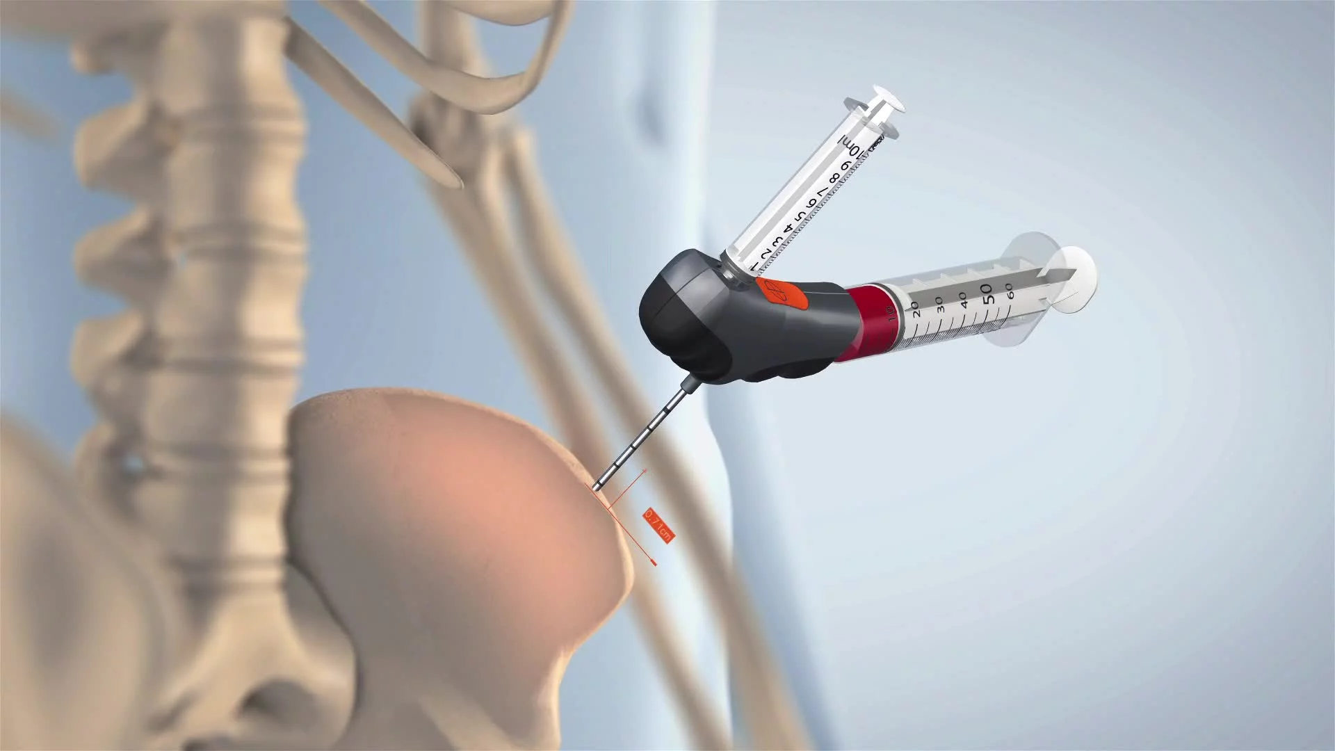
Temporary models filled in for medical gear, and simple rigs let us test how both the patient and clinician moved through various poses—sitting, walking, lying face down, and so on. We paid special attention to anatomical accuracy, especially for scenes like Jamshidi needle insertion and joint reinjection. Medical photos and anatomical diagrams helped us get joint angles, body orientation, and procedural visuals just right.
Each RP scene worked like a "time capsule." Instead of animating full procedures, we focused on a single key action per vignette—enhanced with small movements like a syringe lift or door close. It was all about clarity. And in early dailies, that approach proved more effective than full-motion animation.
We also used After Effects in tandem to prototype overlays: titles, labels, and callouts like “Anesthesia Plan Confirmed,” “60 ml aspirate,” and “Target Area: Spine.” These were first tested in 2D, then brought into 3D space using projection and camera matching for seamless integration and easy readability across scenes.
By the end of RP, we had locked in the entire structure—modular scenes, camera flow, timing, pacing, and overlays—all with placeholder geometry and lighting. That clarity meant clients could approve confidently before we invested in asset-heavy full production.
Early Visual Styles Explored
We started by exploring two ends of the style spectrum: abstract vs. clinical clarity. Early characters were ultra-simplified—low-poly with exaggerated features. Visually bold, but ultimately too abstract for a clinical setting. So we found a middle ground: anatomically proportionate, low-poly characters with readable joints, tapered limbs, facial hints, and consistent posture. It kept the aesthetic modern while maintaining medical relevance.
Set design followed a similar path. Initially, we packed scenes with realistic clinical elements—carts, monitors, tools—but it quickly became cluttered. We pared it back to essentials: an exam table, an ultrasound machine, a centrifuge, an IV stand. That breathing room helped each moment land better. The isometric camera’s clean, orthographic projection added structure and made the simplified environments feel organized and intentional.
We stress-tested the isometric framing too—comparing perspective views, top-downs, and shallow angles. Isometric won out every time. It gave us clean spatial logic, easy-to-follow layouts, and smooth lateral transitions that reinforced the feeling of journeying through the procedure step by step.
Prototyping Animation Concepts
From the beginning, we knew this wasn’t about animating everything—it was about animating the right things. We used minimal movement to support clarity. Think of each scene as a living infographic: mostly static, with intentional bursts of motion to guide the viewer’s eye or add realism.
For the Jamshidi needle shot, we rigged a side-profile view and slowed the insertion into a simplified hip model. This avoided discomfort and kept the action clear. We overlaid the phrase “Jamshidi into posterior iliac crest” to ground the moment. Similar tests were run for the centrifuge (top-down spin and layer reveal) and reinjection (syringe aiming at the labeled target area).
Scene transitions were also prototyped: soft pans transitions moved viewers between dioramas while keeping the modular platforms visible. This continuity made the video feel like one smooth journey instead of a jumpy montage.
Client Feedback Shaping Direction
Client feedback helped fine-tune both the visuals and the voice. One major change involved scaling up the characters relative to the environment so the patient figure was more legible—especially in office-viewing settings. We also cleaned up visual clutter by removing less essential elements like anesthesia carts and C-arms. Clients wanted simplicity and clarity—and that aligned with our instincts.
Script and terminology got revised for legal and clinical accuracy. Every line about stem cell delivery, centrifuge separation, and joint reinjection had to match licensed clinic language. We simplified complex terms and matched each to clear visual cues—like labeling the layers in the centrifuge tube or rewording “stem cell harvesting” to “bone marrow aspirate.”
Final client rounds helped lock in scene labels and sequence flow: “WITHDRAWING,” “SEPARATION,” “DELIVERY.” Directional progression was emphasized too—the patient always moved left to right, creating a natural rhythm and intuitive flow that echoed how we read.
Style Choices and Reasoning
We chose the low-poly isometric style because it delivered on two critical fronts: clean, cohesive visuals and production efficiency. It struck the right balance—refined enough to reflect a clinical brand, approachable enough for diverse patients. The modular setup gave us flexibility for edits and review cycles, while the isometric camera kept visual logic clear and consistent.
By minimizing distortion, we made it easy to place UI elements like labels and captions. And with focused, minimal animation, every movement had a purpose—reinforcing rhythm, clarity, and alignment with the voiceover.
What we ended up with was a complete visual architecture—a detailed procedural guide, broken into clean, digestible chapters. Each had its own identity and role, but everything worked together with a unified tone, a clear mission, and a visual style that respected the subject matter while making it accessible.
Production (Full Production / FP)
Look Development
After the green light on our rapid prototyping, we moved into full production—converting clay mockups into finished visuals. Each diorama platform—from Arrival to Anesthesia, Withdrawing to Delivery—was built out to match real-world clinical workflows, while keeping our clean, low-poly aesthetic intact. Beds, tools, IV bags, syringes—all had to look instantly familiar and be placed logically within the space.
Characters were upgraded from rough prototypes to anatomically accurate, stylized figures. We preserved clarity around treatment zones—spine, hips, knees, shoulder, ankle—so that each pose would make sense across all scenes. Wardrobe also evolved with the journey: casual on arrival, medical gown during treatment. That gave patients visual cues without breaking continuity, keeping everything brand-safe and clinic-ready.
Lighting was calibrated to keep attention where it mattered: on the characters and the procedure. Environmental noise was trimmed way back. Cluttered elements like anesthesia carts and C-arms were eliminated so we could frame each shot cleanly and leave room for future overlays.
Once assets were finalized, we moved into scene layout and animation. Every vignette was built using manually posed characters, each matching a moment in the patient journey: entering the clinic, getting anesthetized, undergoing marrow withdrawal and receiving the injection. Every action tied directly to the script and the clinical workflow.
Animation was used sparingly—intentionally. These weren’t action scenes. They were “time-freeze” snapshots with just enough motion to highlight the essential. Each movement was scripted to sync perfectly with the voiceover, with deliberate pauses at key transitions to ensure comprehension.
The whole flow followed a consistent left-to-right path. Each stage had its own modular space, making the journey feel intuitive and clear. And because each module stood on its own, revisions could be made to any scene without breaking the rest of the animation—a big win for flexibility.
Style Choices and Reasoning
Our visual style was no accident. It was the result of testing, iteration, and alignment with clinical goals. The final look—low-poly, isometric—balanced precision with accessibility. It let us explain a complex procedure while keeping it easy to follow and emotionally neutral for patients.
The low-poly design avoided the creepiness of near-realistic renders, but still gave us accurate anatomy and recognizable tools. Characters had proper proportions and posture logic, just without facial details—keeping them universal and license-ready across different clinics. Environments followed suit: minimal but meaningful, with just enough detail to ground the viewer without overwhelming them.
The isometric camera was a foundational decision. Orthographic framing gave us consistent, distortion-free views that helped each scene feel like a diagram brought to life. That made transitions seamless and reduced the mental load for viewers. Plus, it fit our modular structure perfectly—each platform could stand alone or sit in sequence without breaking spatial logic.
Color was purposeful. We kept base palettes neutral—soft grays, blues—while using bold accent colors for overlays and labels. No textures, no gradients. Just clear, readable contrast that made every element functional, not decorative.
And maybe most importantly, the style was emotionally calibrated. Medical visuals can stress people out. We built a visual system that reassures—calm motion, gentle lighting, simplified forms. It works in waiting rooms, consultation spaces, or online education—wherever patients need clarity and comfort. This wasn’t just a style—it was a visual strategy built to guide, inform, and put patients at ease.
Technical Considerations
We stayed within Cinema 4D and After Effects from start to finish. All overlays—titles, labels, annotations—were built and composited in After Effects. These included scene names like “WITHDRAWING” and “DELIVERY,” anatomical targets like “Knee” or “Spine,” and supporting labels like “Buffy Coat with Stem Cells.”
The modular setup paid off during production. When we needed to add the foot/ankle to the injection segment, we updated just that module—no need to touch the rest of the animation. The same went for adding clarity to the platelet separation vial: it was revised and dropped into the timeline without disrupting flow.
Challenges and Solutions
The biggest challenge? Making sure the animation worked in any setting—whether on a TV in a waiting room or a tablet in a consultation. We tackled it by leaning into our modular design, stripping down props to essentials, and focusing on clarity even without sound.
Timing the voiceover required a few rounds of fine-tuning. We adjusted camera pauses and easing curves to make sure nothing felt rushed—and every key moment had enough breathing room for patients to follow along confidently.
Post-Production & Delivery
Final Compositing & Labeling
Post-production was fully handled in After Effects, where each scene was rebuilt as its own composition. This gave us precise control over layout, timing, and clarity. Once the 3D renders were in, these comps became the canvas for annotation, branding, and reinforcing the overall story. A stylized background texture was added behind each platform to create spatial grounding without disrupting the clean isometric look.
Each step in the procedure got a bold, floating title overlay anchored above the platform using the same isometric alignment. These titles were kept flat and sharp: no shadows, lighting, or 3D effects. Just clean, high-contrast text designed for legibility across any screen. The typography was consistent throughout, reinforcing brand rhythm and visual cohesion.
Anatomical Callouts & Camera Matching
Each injection zone—knee, foot/ankle, hip, spine, and shoulder—was marked with an anatomical icon and floating label. These were integrated using a hybrid approach that combined camera-matched overlays with X-ray-style graphics. The icons were placed in perfect alignment with the isometric perspective, and the X-ray outlines briefly highlighted bone structure or joint positioning before fading to leave behind clean, persistent text.
Labels appeared in a set order that mirrored the voiceover: knee first, then foot/ankle, hip, spine, and shoulder. This order kept the visuals in sync with the narration and followed clinical logic. Every callout was carefully scaled and positioned relative to character poses to ensure clarity without clutter.
Client Feedback & Iteration
Script edits at this stage triggered updates across the comp timeline. Small changes—like correcting “cloth” to “clothes”—meant revising type and shifting animation timing. The injection phase, originally limited to three joints, was expanded to five zones. That meant new icon overlays, plus scene pacing and VO timing adjustments to accommodate the additional steps.
The music track, added early in the process, was re-timed during final edits. We adjusted fades, alignment with transitions, and overall rhythm to create a smoother emotional flow that supported both the visuals and narration.
Technical Strategy & Visual Logic
Every graphic overlay was kept flat and neutral—no shadows, no lighting, no gradients. This helped with clarity and ensured the visuals didn’t imply more realism than intended. The base 3D renders already carried the lighting and visual depth, so the overlays functioned as a clean, precise interface layer.
Camera matching was essential. Because we used an isometric projection, every title, label, and icon in After Effects had to be carefully aligned to avoid distortion. Labels were positioned directly over anatomical zones or tools and held steady as the camera panned across dioramas, maintaining visual consistency and orientation.
Delivery
The final output was delivered in 1080p H.264—optimized for crisp playback and manageable file sizes. This made it ideal for use in waiting rooms, educational presentations, and online portals. Along with the video, we provided an .srt file for closed captions. These were fully synced with the narration and included key on-screen text for accessibility and compliance.
The result was a modular, brand-consistent, medically accurate animation that clearly walks patients through a same-day regenerative therapy. Each section stood on its own but also contributed to a bigger picture—built to educate without overwhelm, explain without jargon, and reassure without losing precision.
Transcript:
Once your doctor has performed all required exams and you have agreed on your treatment plan, you will book the appointment for your visit.
On the day of your procedure you should wear comfortable, loose fitting clothes. Upon arrival you will be asked to complete consent forms and change into a gown. In preparation for your procedure, you will have an opportunity to speak with the doctor and/or the medical team. They will review the plan, talk about what you can expect and answer any last minute questions you may have.
When admitted to the prep area you will be taken to a procedure table where you will lay face down and follow the anesthetics plan that you and your doctor have agreed to.
Once the procedure begins the doctor will be using technologies and techniques to maximize the collection, concentration, and delivery of your bone marrow aspirate or BMA. To harvest the BMA, the doctor will perform several short, rapid draws of around 4 to 6 ccs of BMA with a syringe. The syringe will pull from the area of your hip that has the highest concentration of stem cells, without removing the needle.
During the next step of the procedure, a highly trained technician will use a machine to centrifuge the bone marrow aspirate. After 15 minutes, the BMA collected will be divided into 3 separate fractions because of the weight of each of the fluids.
After processing the bone marrow concentrate, the doctor will deliver the concentrated stem cells into the injured area. A common goal is to deliver a greater number of stem cells to the injured area than your body would deliver naturally.
After the procedure is complete, you will follow the recovery and discharge plan that you have discussed with your physician.