Reactions - Seatex
Pre-Production
Concept & Scripting
The Seatex “Reactions” video was built to scale—literally and conceptually. It opens at the molecular level, where ideas are born, and ascends to the industrial scale where Seatex executes them. The concept framed Seatex not just as a chemical producer but as an operational partner capable of translating innovation into full-scale production. The narrative arc was designed to reflect that transformation, with a structured five-beat progression: molecular brand intro, legacy/scale positioning, operational overview, full-service summary, and CTA close.
From the beginning, the script moved fluidly between metaphor and specificity. It opened with abstract, conceptual language—“Innovation is all around us”—then gradually shifted toward grounded, operational language around services like blending, reaction, and packaging. This mirrored the visual flow: from floating molecules to branded facility renders, from concept to execution.
Client materials helped ground the vision in reality. Seatex provided brand assets and internal footage; we supplemented with satellite and OpenStreetMap data to lock the layout of the Rosenberg facility. This was especially helpful in modeling road access, rail networks, and site geometry with accuracy. These references informed the earliest scene composition choices and were critical for spatial realism throughout the pipeline.
Scriptwriting and visual development happened in tandem. A scratch VO track guided line-by-line visual mapping from the outset, ensuring every line of narration had a planned motion or camera cue. This approach kept the visuals and messaging tightly integrated from day one.
Rapid Prototyping
Rather than drawing static storyboards, we built a living prototype in Cinema 4D. This RP served as a structural framework—defining camera choreography, pacing, and scene sequencing. Assets were abstract: primitive extrusions for buildings, placeholder geometry for molecules, clean isometric blockouts for the facility. The goal was not aesthetic—it was compositional logic and editorial rhythm.
The molecule-to-facility transition was a key moment. We tested vertical zooms and scale shifts to ensure the “lab to railcar quantities” line aligned visually with a dynamic, dimensional shift in scene. The RP also locked framing for branded open and close sequences, using orthographic camera pushes and vertical lifts to provide clean, uninterrupted logo and CTA moments.
All on-screen graphics, stats, and UI elements were placed using placeholders during RP. Their placement and spatial relationship to the scene were locked in advance, allowing later design passes to drop in final assets without layout changes.
Camera moves were fine-tuned throughout. We choreographed sweeping isometric pans of the Rosenberg site, zoom out shots inside molecular space, and clean vertical lifts from tote to macro scale—all keyed directly to narration cadence.
Internal review rounds focused on motion arc and composition clarity. Transitions were refined until the scene progression—from molecules to containers to facility—felt seamless and narratively coherent.
Early Visual Styles Explored
Though RP excluded lighting or final materials, spatial language and camera behavior were developed in detail. The facility was framed in a stripped-down, clean isometric layout—no foliage, no background clutter—so that the infrastructure could take visual priority. This established the stylistic tone: minimal, structured, and purpose-built.
Projection styles were debated early on. Orthographic views offered blueprint clarity, but isometric perspectives delivered better depth and movement. The isometric approach won for its ability to show interconnectivity—roads, tracks, building zones—while maintaining clean lines and navigable compositions.
Client Feedback Shaping Direction
Client input was sharp and targeted. The placeholder molecules were flagged for revision—they needed to look more scientifically grounded. That feedback led to a plan to use PDB molecular data during production, replacing RP proxies with realistic molecular structures.
The call-to-action was restructured based on client use-case clarification. Initially designed for digital embedding, the CTA was reconfigured for broader use—sales decks, live presentations, etc.—and adjusted to include bold contact info. Scene composition was rebuilt to prioritize legibility and screen-readiness for that moment.
With these adjustments integrated, the RP was approved as-is, forming a clear, confident blueprint for final production.
Production (Full Production / FP)
Look Development
Final look development for the Seatex “Reactions” video split into two specialized tracks—molecular-level abstraction and industrial-scale clarity—each with distinct rendering and design goals, but unified through a shared visual language built around sharp, clean contrast and precision.
For molecular scenes, placeholder proxies were replaced with actual PDB models, selected for their visual variation and structural chemistry relevance. These included benzene, propane, fullerene, and others. Once imported and converted to usable meshes, we deployed them using Cloner setups with randomized scaling, offsets, and spatial drift to replicate natural suspension. Atom-specific coloring was applied via material ID tagging, and custom shaders were built with subtle subsurface scattering to suggest organic translucency. Materials were intentionally non-glossy—low IOR, soft light wrapping—to keep the visuals focused on form, not spectacle.
Lighting for these scenes used a combination of ambient HDRI, light wrap, and low-intensity area fills. A baked depth of field and long focal range created cinematic isolation, blurring peripheral molecules into fogged shapes while keeping the hero molecule in sharp relief. Chromatic aberration and bloom effects were deferred to post, but scene balance and exposure were finalized at render time.
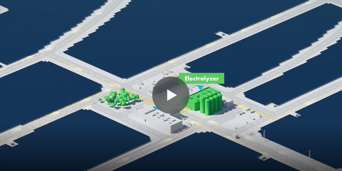
The Rosenberg facility scenes evolved from RP blockouts into a stylized architectural model with true-to-footprint accuracy. Rooflines, building zones, HVAC details, and rail layouts were reconstructed based on OpenStreetMap and satellite data. The result was not photoreal but visually believable—architectural in tone, with real operational logic embedded.
Rail infrastructure was constructed via spline tracing from satellite maps. Tanker cars were animated along those splines using constraint-driven rigs, allowing for fine-tuned spacing, speed control, and camera sync. Models featured ladder cages, fill ports, and surface wear—clean enough for wides, detailed enough for closeups.
Lighting across the facility was bright, neutral, and architectural. A flat white stage environment isolated form, while subtle area lighting reinforced structural volume. Shadows were kept soft and directional to maintain legibility in isometric compositions.
The Seatex logo received custom modeling, with dual-layer materials: a gloss-blue front face and frosted-translucent rear shell. It was lit top-down with soft rim edge to create subtle silhouette definition in the final CTA frame.
Design & Animation
The molecule sequence was rebuilt from the ground up with the final PDB models. Each molecule was animated with unique drift and slow rotation, using Time and Random Effectors to simulate free-floating dynamics. The central molecule followed a scripted Z-space animation, pulling forward into focus as DOF shifted. This synchronized with a forward camera dolly, mirroring the later facility pull-back to create a directional match cut.
The Rosenberg site animation focused on compositional rhythm. We preserved the isometric camera angle but introduced elevation shifts, parallax sweeps, and slow orbitals to maintain movement while keeping spatial clarity intact. The animation cadence matched the VO precisely—each facility service (reactionary, blending, packaging) was assigned a building or infrastructure element and timed to enter frame as those services were named.
Railcar motion was spline-driven, tied to base track geometry with spline constraints. Tankers followed custom spacing logic, aligned with their wheelbase, and were timed to VO delivery about “railcar quantities.” Because railcars were seen in wide and medium framing, we optimized them for motion at both scales using mid-poly assets and instance controls.
The tote yard was built with Cloner grids and randomized per-instance offsets. Each tote featured modeled caps, pipes, and pallet detail, keeping resolution high enough for medium-close flyovers. A semi truck was animated exiting the facility to add texture and life to the wide shot, providing foreground motion without distracting from structural detail.
Style Choices and Reasoning
Molecular scenes were designed for atmosphere: soft DOF, ambient motion, volumetric feel. Facility scenes were engineered for readability: flat stage lighting, isometric clarity, and calm orbital motion. This contrast allowed the narrative to travel from abstract to concrete without jarring shifts in tone.
The isometric layout let us showcase operational scope—rail access, building interconnectivity, product staging—while keeping every frame legible and stylized. Perspective distortions were avoided, and camera motion was strictly constrained to maintain continuity and prevent disorientation.
Color logic was brand-forward: Seatex blue and safety yellow were mapped to key infrastructure—tanks, railcars, UI overlays—while all other tones were pulled back into neutral greys and whites. This kept visual focus aligned with brand and messaging, and allowed for cleaner integration of UI in post.
Technical Details
Everything was built in Cinema 4D, rendered in Redshift. All shaders used physically based nodes with layered textures—Fresnel masks, SSS layers, and roughness blending. Facilities used low-LOD proxy assets for distant objects and mid-poly geometry for any surface that appeared in close framing.
Final rendering included multipass output: beauty, emission, shadow, specular, SSS, object buffer, and depth. Molecule scenes were rendered with baked-in DOF; facility scenes used depth passes to composite focus and atmosphere in post.
Collaboration & Revisions
Feedback flowed continuously between internal creative and client stakeholders. RP helped lock structure, so FP notes were visual and timing-specific. Molecule realism, building color accuracy, and railcar placement were all revised. The flare boom was moved mid-production to match reference. Color accents on totes and railcars were updated based on product safety standards.
Modular scene construction made these revisions efficient. Each sequence existed in its own rigged environment, with top-level control over asset timing, placement, and motion.
Challenges and Solutions
Biggest challenge: making the molecule and macro worlds feel part of the same story. We solved it through directional camera logic—a match-move zoom and pullback that created visual echo across scale.
Another challenge: rendering molecules with heavy DOF and SSS without compromising speed. We optimized by reducing Cloner counts for non-focus molecules, proxying depth passes, and baking blur on a per-layer basis. This saved render time without affecting final visual clarity.
In the end, the Seatex “Reactions” video delivered on its premise: turning abstract chemistry into structured infrastructure—visually sharp, narratively tight, and strategically engineered.
Post-Production & Delivery
Final Compositing & Color Grading
Post-production for the Seatex “Reactions” video centered on a clean, controlled After Effects pipeline, optimized for modular adjustments and tight visual alignment with brand standards. All 3D-rendered assets were delivered as linear EXR sequences with full AOV support—diffuse, specular, reflection, SSS, shadows, and Z-depth—allowing maximum flexibility in post without re-entering the 3D pipeline for minor adjustments.
Molecular sequences were the most heavily composited. Z-depth was used to enhance foreground isolation, build depth-of-field rolls, and guide viewer focus on key molecular structures. Gentle chromatic aberration and a slight lens distortion were layered into push-ins, creating optical energy without undermining clarity. Additional local contrast and vibrancy were applied to atom surfaces—specifically red, blue, and white elements—to differentiate overlapping clusters and elevate structural complexity.
Facility flyovers were treated with restraint. Whites were globally corrected to neutralize HDRI influence, ensuring brand colors stood clean against the minimalist environment. Color isolation passes protected Seatex blue and yellow from unintended tone shifts during overall balancing.
Subtle visual effects were layered throughout to reinforce tone and enhance rhythm. In molecular scenes, light occlusion overlays and moving gradient fog simulated low-density volumetrics—giving the illusion of atmosphere without taxing render resources. Light bloom and glint effects on atom edges were applied using luminance masks, adding dimension and internal glow. A radial blur pulse on the final molecule zoom created a smooth visual cue for transitioning into the facility sequence.
Infographics, UI Overlays, Data Visualization
Callouts and overlays were added in After Effects using camera-tracked nulls from C4D exports. Typography followed Seatex brand specs, using a clean rounded sans-serif font with strong legibility and restrained animation.
The core service stack—“Reactionary / Blending / Packaging / No Middlemen”—was animated in as a locked panel, synced directly to VO timing. Each word was spatially aligned to a facility zone, using glass-blur background panels for contrast against high-detail surfaces. Entry/exit used short ease-in animations with brand-color accents.
Molecular annotations—formulas, structural names, wireframes—were animated as shape layers and 2.5D parallax elements. These were locked to scene space and oriented with nulls, maintaining their position and legibility during DOF shifts and push-in sequences.
Ensuring Brand Consistency & Final Delivery
Seatex blue and yellow were maintained across all passes with locked qualifiers. All typography followed the brand hierarchy, and motion behavior aligned with brand tone: clean, calm, precise. The Seatex logo appeared in intro, transition, and CTA sequences with consistent lighting and scale logic.
The final CTA frame was restructured late-stage to include both phone and web. A yellow-framed box design was implemented, matching prior UI cues. This was animated with a clean slide-up motion and soft fade, preserving visual energy without cluttering the frame.
Two structured client feedback rounds were completed. The first included placeholder audio; the second integrated final VO and color. Key revisions included molecule brightness tuning, callout timing alignment, and small adjustments to railcar cadence. All changes were handled in AE using layer timing and opacity curves—no 3D re-renders were required.
Final delivery included:
Master Video: 1920x1080 ProRes 422 HQ
Web Version: 1080p h.264 MP4
The final product reflects Seatex’s dual strengths: deep chemical expertise and large-scale operational execution—delivered with clarity, brand alignment, and visual polish.
Transcript:
Innovation is all around us. The building blocks of innovation often start at a molecular level. Creating these molecules takes knowledge, determination and the right partner.
With more than 50 years of experience as a leading chemical blending company with multiple state-of-the-art facilities, Seatex should be your first stop to see how we can bring your reaction chemistry to life.
We’ve helped companies and technology owners bring new and old molecules all the way from the lab scale to railcar quantities providing companies a “one-stop shop” for their reactionary, blending, and packaging needs, cutting out middlemen and reducing total cost of ownership.
Call Seatex today to learn more.