HyRate - Product video
Pre-Production
Concept & Scripting
The HyRate product video was built to do two jobs: clearly explain a complex piece of engineering and sell it. The focus was Liberty Lift’s new patent-pending method that allows its HyRate system to shift from annular to tubing flow—without expensive, time-wasting interventions. Our job was to make that transition make sense at a glance. The animation had to deliver visual clarity for a highly technical audience while holding the polish expected of photorealistic CGI.
Script development ran in parallel with early visual planning. Every line of voiceover was synced to a planned visual moment—so engineering benefits and operational value were always paired on-screen. Instead of throwing a wall of technical specs at the viewer, the script unfolded in a logical flow: starting with the headaches of traditional gas lift systems, and walking viewers step-by-step through how HyRate solves them—faster, simpler, and with more flexibility.
Client-provided materials like capsule photos, mandrel images, vector logos, and schematics anchored our creative process right out of the gate. These grounded the visuals in reality. Ongoing conversations with the Liberty Lift team gave us the details we needed—mandrel length, outer diameter, valve geometry.
We repeated them with visuals and labels that hit at the same time as key narration. That kind of integration locked in the message and kept the animation technically accurate while still persuasive.
Rapid Prototyping
The rapid prototyping (RP) phase was where editorial met engineering. We tested how to space things out, how fast the animation should move, and how to keep the narrative clear. The HyRate tool itself was modeled from scratch in Maya using real-world references and dimensions. Early versions skipped textures and lighting—we stuck to flat materials and focused entirely on the physical logic of the tool.
We built out a series of motion tests to tell the technical story well. These started with surface flyovers and went all the way down to vertical geological cutaways. A big part of this was nailing camera behavior as it moved through these scales—wide landscape shots of well pads transitioned into tight, detailed views of the tool and valves. These moves were animated with dolly-ins and spline paths that mimicked smooth drone-style camera movement.
Every flow path—blue and yellow arrows—was animated along spline paths to reflect actual well flow. Color-coding made it simple: blue for gas, yellow for pressure or lift. These had to be precise. One client note had us adjust the gas arrow entry point to reflect actual downhole behavior. These overlays became the heart of the animation’s educational value, and they carried through to the final render.
We were also building out the terrain and geology at this point. This wasn’t a product demo in a vacuum—we needed a believable underground environment. We studied shale formations and stratigraphic layering from real U.S. well sites, digging into core samples and field photos. That research shaped the cross-sections, giving us stacked polygonal planes that looked like actual rock layers, with the borehole running vertically through them.
That realism wasn’t just for looks. It gave credibility to the HyRate system. Showing the tool operating in a geologically believable setting helped viewers mentally place it in their own operations. We weren’t just telling a story—we were showing it could actually work.
Style Choices and Storytelling Logic
From day one, we locked in on a style we call “clean realism.” The animation needed to be polished but not sterile—technically sharp without looking like a medical diagram. Every asset was modeled with real-world rules in mind. Tubing was the right size. Valves were in the right place. Geometry matched what Liberty Lift builds in the field. Even without textures or lighting at this stage, the layout and movement respected spatial reality.
We used continuous camera movement instead of hard cuts to help viewers stay oriented. That movement helped show the relationship between the HyRate tool and the full field system—starting at the surface and diving into the downhole view in one smooth motion. Even placeholder elements like tanks and pump jacks were roughed in, giving us visual anchors that kept the environment believable. These would be textured later, but their early inclusion helped the story stay grounded.
A big part of the pre-production logic was shot pacing. Each scene was built to communicate one key idea. First, show how conventional lift works. Then, the problem. Then, show the HyRate tool in action. Only once the viewer understood the capsule mandrel’s role did we introduce the wireline plug and the transition to tubing lift. That logic came straight out of early RP edits—when things felt too fast or too dense, we pulled back, reshuffled camera arcs, and let the story breathe.
Client Feedback Shaping Direction
Liberty Lift’s feedback was detailed and exact—which helped us tighten everything from visuals to VO. One early callout: the original gas lift valves were shown as curved, but they’re actually hard “L” shapes. That correction shaped both modeling and camera sequences, especially for cutaways that showed valve movement.
Another key note: flow arrows had to align perfectly with real-world operation. Blue gas flows needed to come in vertically. Yellow pressure arrows had to pass directly through the valve. These tweaks weren’t just cosmetic—they required rerouting animation splines and adjusting VO to sync with new visuals.
Late in RP, Liberty Lift asked us to call out an additional feature: “can be run with or without a packer.” We added this as a bullet point in the feature summary scene. That meant adjusting both the length of narration and the screen time of that shot to keep everything balanced.
They also wanted stronger brand presence—specifically a lower-third HyRate logo and a “Patent Pending” tag throughout the animation. We staged those during RP so we could see how they’d coexist with on-screen movement and ensure they didn’t block critical visuals.
By the end of RP, we had fully approved scenes, locked-in camera choreography, and confirmed asset placement—setting us up to move into full production with texturing, lighting, and final rendering dialed in.
Production (Full Production / FP)
Look Development
With the script locked and camera paths approved, Full Production zeroed in on visual fidelity. Every texture, light source, and rendering pass was calibrated to hit our benchmark for “clean realism”—high-end polish with technical clarity. This wasn’t about flash; it was about making the engineering story unmistakably clear.
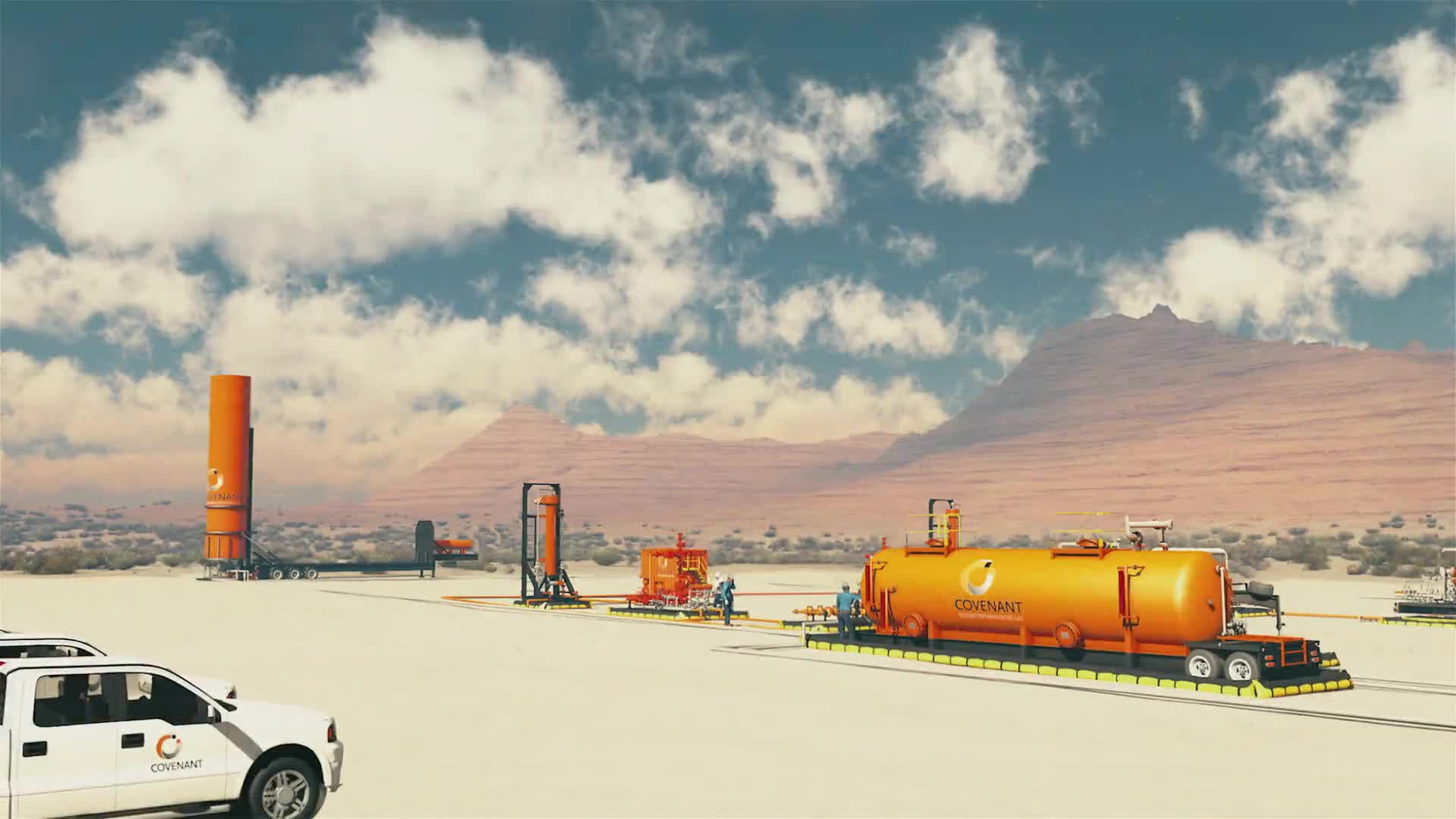
We started with a full overhaul of the geological strata. What had been stand-in geometry during RP became fully sculpted terrain—stratified shale and sediment bands built with care. Each layer had its own texture map to communicate composition, density, and mineral makeup. We worked with physically based rendering (PBR) from the ground up—layering materials to simulate compacted claystone, fractured limestone, and embedded shale seams. These weren’t just backgrounds; they were tied directly to flow transitions and helped explain where annular lift kicks in vs. where tubing production takes over.
For the surface terrain, we used projection mapping on a simplified mesh. This let us keep camera movements smooth without losing visual richness. Topside textures included pad outlines, roads, and tanks—all grounded in reality. Additional 3D assets like frac tanks, closed-top water tanks, and surface wellheads were added in, all matched to the same lighting setup to maintain sun direction and natural shadows.
The HyRate tool got high-fidelity textures using a full PBR pipeline. Both the external capsule mandrel and the tubing-mounted valve were modeled to spec, but we used visual cues to distinguish them. The capsule carried a matte industrial red finish, complete with directional reflections, light edge wear, and ambient occlusion tucked into seams. Roughness maps added micro-level scratches and scuffs to show field use without making the tool look worn out. For the valve ports and end caps, we used brushed metal textures with anisotropic highlights to simulate clean, machined finishes.
Lighting was all about support—helping the story land, not getting in the way. Cross-sections were lit using area lights to simulate daylight bleeding in from the surface. Close-up tool shots used soft fills and rim lights to bring out contours and material texture. Everything was color-accurate and linear—no warm filters or stylization to distract from the product.
Design & Animation
With blocking complete, we moved into refining motion. Every camera move was cleaned up—spline paths smoothed, VO timing matched, transitions refined. The goal was to keep spatial logic front and center. One standout sequence: a seamless drop from the surface-level pad into a cutaway of the borehole. No cuts, just one continuous plunge that tied HyRate’s surface infrastructure to its downhole performance.
Flow visualization was front and center. Spline-based arrows became motion-blurred particle trails, bringing directional gas and pressure flow to life. Blue arrows—semi-transparent with a soft glow—represented gas. Yellow arrows, showing pressure flow, were timed to move precisely through valve transitions. One key client revision had us route blue gas arrows from the bottom of the tubing instead of the side—to match actual flow physics. Yellow flows were animated to pass cleanly through valves with timed transitions that matched real-world behavior.
The slickline plug removal sequence was carefully staged. We showed a wireline tool enter, extract the plug, and redirect flow to the inner tubing string. This demanded tight timing and clean animation layering—wireline path, plug removal, and redirected flow all needed to happen in order without clutter. Close-up shots with high-contrast lighting kept the focus sharp.
We used a split-view system to show both capsule and conventional mandrels side by side. Modeling differences like wall thickness and mounting hardware were shown in real time, reinforcing Liberty Lift’s modular approach. While the flows toggled between annular and tubing lift, both mandrel types stayed visible—showing options, not just features.
Style Choices and Reasoning
Everything about the look and motion of this animation pointed to one thing: engineering trust. The photorealistic style wasn’t there to impress—it was there to make the technology believable. No gimmicks. No metaphors. Just straight-up technical clarity. That was essential for a product built to cut downtime and save money in high-stakes well environments.
Color use was tactical: red for tool bodies, blue and yellow for flow, and muted neutrals for geology. That restraint kept attention where it belonged—on the tool and what it was doing.
Camera motion stayed clean and deliberate. No dramatic pans or fast cuts. Just steady movement to preserve orientation and prevent cognitive overload.
Our dual-scale approach—shifting from topside layouts to downhole mechanics—helped deliver a complex story without confusion. It showed how the HyRate tool fits into real operations, how it works, and what it solves—all without breaking flow.
Technical Details
Final modeling was done in Maya. Animation was handled in Cinema 4D. Rendering was completed in V-Ray. Terrain, mandrels, valves, and surface assets were built as modular elements optimized for instancing and render speed. PBR materials were authored in Substance Painter and Photoshop, giving us full control over how every surface looked and behaved.
We used V-Ray’s physical camera system to dial in depth of field, motion blur, and lens effects—adding a tactile, macro-shot realism. Render settings were balanced to keep quality high and noise low without blowing out production time. HDRI domes gave us natural-looking reflections and helped anchor surface realism.
Compositing happened in After Effects, using exported camera data from Cinema 4D. That’s where we handled all the final polish: text overlays, flow highlights, glows, and lens flares. The separation of render and post let us iterate quickly when client feedback came in.
Speaking of which—client feedback at this stage was minimal. Liberty Lift came back with just a few tweaks to arrow timing and flow direction. Once those were locked, we moved straight into final comp and delivery.
Post-Production & Delivery
Final Compositing & Color Grading
After final renders were completed in V-Ray, we moved into compositing inside After Effects, using a multi-pass approach to give us granular control over every layer. Beauty, AO, reflections, specular, and Z-depth passes were all separated, letting us dial in precision edits across geological surfaces, equipment materials, and flow visuals—without triggering time-consuming re-renders.
Color grading focused on keeping tonal balance consistent from frame to frame. The cross-sectional geology leaned into warm greys and muted browns, while the HyRate tool held its signature industrial red. Directional rim lighting was preserved with grade masks, helping tool edges pop against darker rock layers. We used curves and levels to maintain contrast in midtones, while carefully lifting shadow detail in tighter interiors. Highlights were controlled to keep surface detail intact across both mandrels and terrain.
For underground closeups, we added a soft lens vignette and refined the depth pass to subtly blur background layers—adding focus without visual clutter. The result was a sense of weight and dimensionality that kept the viewer anchored.
Text overlays were composited directly into the 3D environment using Cinema 4D’s camera tracking data. This ensured that as the camera moved, the overlays stayed exactly where they should. The benefits list near the end of the piece faded in cleanly, using basic opacity ramps and motion tracking. We skipped any heavy animation—no sliding or bouncing—just clean, professional typography designed for clarity.
We stuck with a single sans-serif font family that matched Liberty Lift’s brand style. White was used for general text, while Liberty’s brand blue highlighted flow labels and callouts. Placement was checked across a range of screen sizes to make sure everything read well in full-screen and embedded views.
VFX were kept minimal to stay aligned with the clean, technical tone. A soft bloom pass was added to flow vectors to help blue and yellow arrows separate from complex backgrounds. Glow levels were kept subtle—just enough to make overlays feel integrated without floating above the environment.
We avoided lens flares completely. Instead, we introduced realistic falloff in light transitions—from surface terrain into the downhole environment—to simulate natural underground dimming. In macro shots of valve interiors, we used minor chromatic aberration to simulate shallow-depth photography, adding realism without distraction.
Motion blur was baked into key render passes and selectively enhanced in post. This added smoothness to fast-moving arrows without compromising spatial clarity—especially important during flow shifts and plug removal sequences.
Infographics, UI Overlays, and Data Visualization
This wasn’t a dashboard-style video. All data and visual callouts were embedded directly in-scene using clean typography and simple vector elements. No flashy infographics—just technical annotations that made product features understandable.
Vector overlays for pressure, valve transitions, and flow direction were animated in After Effects using shape layers and spline masks. This gave us timing control without having to re-render any 3D assets. Every label was styled with solid fills and no borders, ensuring fast readability with no visual clutter.
The “Patent Pending” tag and Liberty Lift logo watermark were composited as a fixed lower-third element. They stayed on screen throughout the key content blocks—visible but never overpowering.
Final Edits & Optimization
The last edit round focused on precision client feedback. The final edits involved adding the "can be run with or without a packer" benefit, adjusting the HyRate logo reveal timing for better narration sync, and ensuring clean alignment of directional arrows through valve geometry.
From start to finish, brand consistency stayed locked in. Colors, fonts, logos, and visual behaviors were benchmarked against Liberty Lift’s current marketing materials. The HyRate red was matched precisely in tool texturing. All typography followed a clean sans-serif style—no flourishes, no deviation.
Logo placement followed strict rules—clear space, proportional sizing, and consistent positioning throughout the cut. For the final scene, logo and contact spacing were balanced to keep the message clean without blocking key visuals.
Every frame and scene passed through visual QA to eliminate off-brand elements. Client notes on pacing, text sync, and callout visibility were implemented without compromise and double-checked across review rounds.
Liberty Lift provided sharp, real-time feedback. Every change was versioned and tracked to prevent regression. Preview links and downloadable files supported multi-device reviews to confirm playback quality across platforms.
Delivery
Final deliverables included:
Primary video: 1080p MP4 with embedded Liberty Lift and HyRate branding
Alternate version: Clean 1080p cut without logos
SRT file: Fully synced captions for accessibility and web platforms
High-resolution stills: Rendered tool configurations and keyframe poster (7200×10800)
Every asset was prepped for web, event, and client use. Final files were uploaded for integration on the Liberty Lift website, with a private download link for immediate distribution to clients and partners.
Transcript:
Liberty Lift's patented HyRate gas lift solution enables annular lift for initial production and the switch to conventional lift or free flow up the tubing without the need for work offers.
While gas lift equipment has not changed dramatically for many decades, there are now higher initial flow rates produced from unconventional wells and a greater incentive to maximize that production earlier in the life cycle.
Annular gas lift flow rates are higher because of its larger diameter and flow area. As the well continues to unload and effective bottom hole pressure drops, flows must be redirected to the tubing for more efficiency.
Normally, a rig is needed to pull the tubing to switch from annular to tubing flow. Liberty Lift has developed HyRate, a more cost-effective gas lift solution for optimizing both initial production and maintaining rates as the well moves to tubular flow.
Our HyRate lift system uses special capsule mandrels mounted externally on the tubing string to allow higher-rate annular gas lift flow. The HyRate system can also quickly rid the annulus of flowback fluids from offset frac wells.
As the wells natural flow declines, lift can move from annular to tubing with minimal rigless interventions. HyRate mandrels remain in place throughout, while pre-set external mandrels allow the change to conventional flow with full drift and no internal constraint.
The benefits are clear. High initial production, switch from annular gas lift to tubing gas lift with no work over interventions and optimized for the life of well production.
HyRate another Liberty lift innovation from people with the experience to provide the best artificial lift solutions for your well.