Exodus (introduction)
Pre-Production
Concept & Scripting
The Exodus animation was designed from the ground up as a precision-grade product showcase—built with the same attention to detail you’d expect in the OR. Every movement, every interface, and every interaction had to mirror real-world surgical behavior. This wasn’t about making something look good—it was about getting it technically right, down to the exact torque on a cup cutter or the modular logic of each tray.
The process kicked off with highly detailed engineering files from the client: complete STEP files for every tray and component, annotated CAD renders, plus supporting materials in both video and written formats. These weren’t just helpful—they were essential. We built a centralized reference system that linked each part to its surgical role, physical interaction, and visual output. This masterboard functioned as both an index and a technical bible, anchoring the entire production in mechanical and procedural accuracy.
Each line of narration synced with real-world tool behavior—highlighting ergonomic designs, illustrating mechanical performance, and reinforcing the logic of the tray system. The tone stayed clean, assertive, and surgical—because the audience was made up of people who live this in the OR. That alignment between narration and function became the backbone of the animation, providing both structure and technical clarity.
Rapid Prototyping
Given the complexity, we jumped into a tightly controlled Rapid Prototyping phase using Cinema 4D. The STEP files from the client were rich in geometry but needed significant prep: sorting, ID tagging, poly reduction, cleaning normals, and renaming everything to fit a modular, animation-ready structure. At this stage, we worked in raw geometry only—no textures, no shaders—just pure form and function.
RP wasn’t a placeholder. It was an evolving production blueprint. The priority was clear: demonstrate how each tool worked, how they linked together, and how we could visualize the modular logic. Lighting stayed flat—basic HDRIs or grayscale fills—so we could zero in on motion, camera logic, and interaction sequencing.
Early sequences set the tone. One key challenge was animating a hero handle linking to a range of interchangeable tools—each with a unique fit, orientation, and threading path. This wasn’t just assembly; it had to convey variability and compatibility. Each micro-animation had to feel smooth and intuitive, even as the camera aggressively pivoted to highlight different configurations. We built multiple versions, iterated rapidly, and honed timing down to sub-frames for visual cohesion and mechanical authenticity.
Internally, every scene was reviewed like we were the ones doing the surgery. Animations were judged on anatomical realism, mechanical sequence, and logical clarity. We worked in layers—blocking first, then motion nuance, then secondary animation like blade clicks, lock snaps, and torque twists. Every scene got scrubbed frame-by-frame—flagging anything that broke spatial logic or created confusion. Detailed revision logs tracked changes across shot design, orientation, and procedural alignment.
Client feedback at this stage was intense—and absolutely critical. Sometimes, new anatomical info drove complete reworks. One example: the slap hammer scene for femoral stem removal had to be rebuilt from scratch after clarifying the real-world function of the backslap handle in hip procedures. Other notes zeroed in on specifics like blade pairings, transparency rules, or camera placement. Another flagged the threading direction on a Tommy bar—prompting not just a fix, but a full audit of similar interactions.
To manage this level of accuracy, we built RP-only utilities: animated tracers to verify tray-insertion paths, null structures to isolate compound rotations, and timeline bookmarks to line up VO with camera cues. Every scene was versioned, with logs showing revision history and sign-off status.
To visualize modularity, we created a UI-style scrolling shot—think game interface—with a central static handle and surrounding attachments sliding past. This used Z-locked depth alignment to keep perspective flattened, and we fine-tuned the timing so each attachment could be clearly recognized in motion.
Some sequences demanded full anatomical mockups. We rigged a transparent patient for both hip and knee procedures, added cloth simulations for surgical drapes, and hand-aligned bone geometry for accuracy. Tool interactions—like cement removal or impaction—were animated based on deep dives into live procedural videos to capture real movement behaviors.
We also introduced split-screen layouts to show hip and knee procedures simultaneously. This required locked timing and narration alignment so nothing felt duplicated or confusing. These sequences were especially sensitive—any mistiming between the left and right sides broke the clarity, so timing was finessed to perfection.
Early Visual Styles Explored
Once RP scenes were approved, we moved into lookdev. Materials had to feel right—not overly CG, but crisp and tactile like real surgical tools. Shader testing covered stainless steel, anodized aluminum in black and blue, Altin coatings for blades, and Radel-style plastics. For silicone grips, we added subsurface scatter. Trays needed edge highlights and catchlights, but we avoided anything too flashy or stylized.
The patient model evolved into a translucent, glass-like shader—providing a clean, clinical view into tool-bone interactions.
The backdrop was locked to a neutral silver-grey—clean enough to let overlays and tools pop, but subdued enough not to compete visually. We tested light cones and vignettes during early lookdev passes to create visual isolation in dense assembly shots.
Prototyping Animation Concepts
A few RP scenes doubled as R&D sandboxes for more advanced systems. Tray latch behaviors were animated with IK constraints and rotational tension logic. In the slap hammer sequence, we used rigid body simulations to test bounce and recoil—then switched to hand-keying for fine timing control.
In the cement cleanup shots, we built a fractured physics pass for realistic debris, then selectively baked and adjusted chunks for more controlled pacing.
Tracer paths for tool motion used C4D’s Tracer object and spline sweeps, paired with motion blur and fading trails to polish the look. These were built to integrate smoothly in compositing without sacrificing realism.
Camera logic required its own prototyping layer. We developed orbit systems ranging from tight 15° moves to sweeping 180° arcs—each orbit balanced clarity with the need to show functional connections. Null rigs managed parallax and framing, and multiple speeds were tested to find the right visual rhythm.
Client Feedback Shaping Direction
Client input didn’t just tweak shots—it reshaped them. Early notes prompted a faster, cleaner open with more dynamic tray reveals. Requests around transparency, bone visibility, and procedural clarity led to significant upgrades in anatomical shots.
By locking in these structural and visual decisions during RP, we ensured the Full Production phase could be focused on polish—not overhauls. Every tray animation, every callout, every tool interaction—had already been vetted, validated, and signed off.
Production (Full Production / FP)
Look Development
Full Production kicked off with a deep dive into look development, aiming for surgical realism, material clarity, and a disciplined aesthetic—all rooted in medical-grade precision. Built in Cinema 4D, shaders were purpose-built to reflect the exact materials specified in pre-production: 455 stainless steel, raw and color-anodized aluminum, Altin-coated blade edges, Radel polymers, and medical-grade silicone grips. Each material needed to read cleanly under both simple and complex lighting, while holding visual cohesion across the board.
For polished metals, we developed multi-layered reflection shaders using Fresnel blending and micro-normal detail. Altin-coated blades were tuned for their signature purple-black sheen with sharp bevel highlights, calibrated through reflection falloff and hue balance. Plastics like Radel were given subtle albedo shifts and micro-bump mapping to avoid visual flatness. Silicone grips used layered subsurface scattering to create soft translucency—especially effective in close-up orbitals where grip texture and material behavior needed to feel tactile and real.
Tray visuals had to walk a tightrope between industrial utility and product clarity. Custom shaders combined metallic flake with satin surface properties, and color-coded anodization to reflect system logic. Every tray component—latches, inserts, tray walls, footpads—was prepped with separate material passes. MultiEXR output included layers for ambient occlusion, reflections, and material IDs, giving compositors precise control in post without needing to re-render.
Lighting was built around a neutral silver-grey background, giving clean contrast against darker trays and making space for UI overlays without visual clutter. We used a hybrid of HDRI environments and strategically placed area lights. Dozens of HDRIs were tested, optimized to reflect cleanly off both matte finishes and polished surfaces. For tray-specific shots, we introduced volumetric lighting using gradient cones to draw the eye without masking component details.
The opening shot brought its own lighting challenge. As the camera navigated dynamically between tools and attachment points, we needed consistent lighting across wild angular shifts. We solved this with manually placed area lights—softbox-style—around hero objects, adjusting intensity and color temperature per camera pass. Custom falloffs and light linking isolated reflections and preserved material accuracy through the entire shot.
All lighting and shading setups were designed for MultiEXR output. Final passes included reflection, AO, diffuse, object buffers, cryptomattes, depth, motion vectors, and material masks—ensuring full post flexibility and detailed control for final composite.
Design & Animation
The jump from RP to Full Production was all about turning validated sequences into polished, physical-feeling animations. RP nailed function and order; FP layered in precision physics, friction, and the right kind of mechanical timing that made everything feel convincingly real.
Snap-ons were reanimated with physical offsets, easing, and micro-delays that mimicked spring tension and lock-in torque. In the modular handle sequence, we synced the outer housing rotation with internal blade alignment using null-driven constraints—mirroring the actual product’s behavior right down to the degree. These weren’t flourishes—they were technical reenactments built for accuracy.
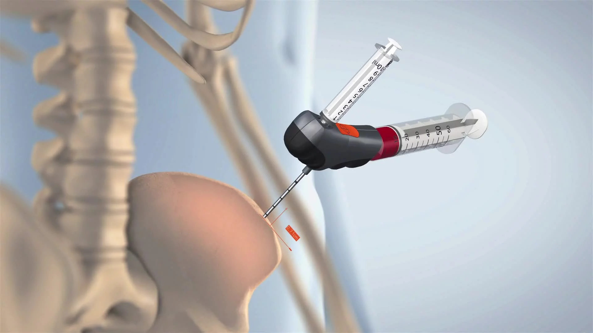
One standout shot involved the acetabular cup cutter. We used Boolean geometry slicing mid-animation to open up the implant interface and show the blade’s interaction with bone. As the Tommy bar came into view, we animated its threading movement with torque-calibrated timing and matched it to the tool’s real-world action. The scene relied on tight coordination between transparent overlays, bone visibility toggles, and rotational logic—tying abstract explanation to real mechanical behavior.
Animating the semi-transparent patient required a different rigging approach. Zone-based deformation controllers let us isolate hip and knee regions, and manually aligned skeletal geometry ensured every tool engaged anatomical structures correctly. Whether targeting the femur or acetabulum, every frame was built to respect surgical realities.
The surgical drape added an extra layer of realism. Built with a cloth sim pass and gravity constraints, the mesh conformed to the body’s shape and shifted per scene. It wasn’t just aesthetic—it directed the eye and masked irrelevant areas while keeping surgical focus intact.
In tray-fill scenes, we expanded the reverse-animation approach: tools were first scattered manually, then reverse-keyed into their final tray positions. To boost visual flow, we used the Tracer tool to map out motion trails—rendered as spline sweeps—giving each movement a guided path and intentional momentum.
Cement cleanup required custom physics. We created rigid-body cement fragments, triggered by tool contact and governed by dynamic forces. But raw sims were too chaotic, so we baked and manually adjusted select fragments to choreograph the cleanup—balancing realism with clear storytelling.
Camera work was designed to lead the narrative. From 15° micro-orbits to full 180° arcs, each camera rig used a central pivot null with layered secondary motion—sway, drift, and easing. Close-up orbitals emphasized material and texture. Product flyovers used slow ramps and deep Z-pushes, letting the viewer take in dense configurations without fatigue.
Depth of field was tuned per shot using null tracking and adjustable blur radii. These helped isolate key surgical actions while maintaining compositional hierarchy—guiding the eye to what mattered most and keeping the visual flow clean through high-information sequences.
Collaboration & Revisions
Collaboration stayed intense through Full Production, centered on refining realism, syncing visuals with narrated content, and making sure every frame passed the clinical sniff test. Most of the animation logic was already locked, but the client’s feedback didn’t slow down—it got more surgical, targeting micro-adjustments to bring every detail in line with real-world expectations.
Tool behavior was another hot zone for corrections. One key revision involved the hip-side scene, where the slap hammer was originally shown instead of the correct femoral claw action. The client clarified this was a clinical mismatch, so we rebuilt the scene: new geometry, new motion logic, VO realignment—the works. Same thing happened later when the knee-side cleanup tool was updated from a reverse curette to a shorty gouge. Again, not just a swap—we reanimated the interaction to reflect proper tool trajectory, bone contact, and response physics.
Throughout the entire process, the client stayed laser-focused on accuracy. Tool labeling, positioning, and orientation all had to line up with real surgical practice. If a bone entry angle looked off by even a few degrees, or if a label obscured something critical, it triggered a note. These revisions were logged scene-by-scene, fixed in final passes, and validated against procedural docs and reference media.
Nothing moved to final render without explicit client approval. Every tray layout, material finish, bone interaction, and VO match had to be double-checked before locking the shot. This stepwise feedback loop wasn’t just useful—it was non-negotiable. It ensured that the final piece could work as both a high-end marketing asset and a clinically accurate training tool.
Post-Production & Delivery
Final Compositing, VFX Enhancements & Color Grading
Post on Exodus was all about precision—handled entirely in After Effects using a high-control compositing workflow built around MultiEXR renders from Cinema 4D. Each scene was split into control layers—AO, reflection, Z-depth, motion vectors, object buffers, cryptomattes, material IDs—giving us full post-production flexibility without needing to re-render base 3D content. That level of control was critical for polishing visuals and responding to detailed client notes during the final review cycle.
Depth-of-field was reconstructed from Z-data, letting us isolate tools from trays or background elements in post. That made a big difference in UI-heavy scenes—keeping the viewer focused on the action while downplaying background clutter. In scrolling tool bank sequences, we animated depth masks over time to simulate lens racking, pulling the viewer’s attention as components moved through center frame.
Volumetric lighting—rendered as separate cone passes—was added in post via additive blending. We used these sparingly, mostly during tray reveal or component-pull moments, and always with controlled falloff and color temp to match FP’s physical light rigs. Motion trails for high-speed tool actions were built from exported spline paths, swept with directional blur and subtle glow, adding energy without stealing focus from the core procedural logic.
Other subtle VFX included lens blur, chromatic aberration, and grain overlays—primarily in macro-product shots or transitions. These touches helped tie scenes together, soften overly CG edges, and reinforce continuity between abstract UI metaphors and grounded surgical content. Final color was managed in calibrated sRGB and checked against TightLine’s approved materials to ensure visual consistency across brand touchpoints.
Infographics, UI Overlays, and Data Visualization
A major lift in post went into building and syncing UI overlays, callouts, and dynamic labels—because these weren’t just aesthetic flourishes. They carried narrative weight, clarifying modular logic and surgical function where narration alone couldn’t keep up.
All overlays were built in After Effects, anchored to positional tracking data from C4D nulls. These nulls were tagged to key objects during animation, ensuring overlays stuck in perspective as the camera moved. The result: labels that looked like they were part of the shot, not just pasted on top.
Overlay design followed a tight visual system grounded in TightLine’s brand palette—blues for active tools, greys for inactive, and orange for modular points. Fonts were client-approved, sized and spaced based on distance to camera and on-screen scale. Even in complex scenes, typographic discipline kept things legible and consistent.
In the modular handle sequence, we brought in a UI metaphor drawn from game design—a central handle flanked by scrolling attachments. Highlights, pulses, and lateral shifts suggested interactivity, with a carousel-style flow that felt intuitive and dynamic. All transitions were hand-keyed and synced to the VO beat-by-beat, with subtle sound cues added during final mix to reinforce movement logic.
Throughout the hip and knee sequences, every key tool got a component callout—name, function, sometimes a motion path. These were animated using shape layers and tracked mask reveals, ensuring that overlays matched the action on screen.
Overlay choreography was tightly managed. In complex frames, labels entered one at a time to avoid clutter. Focus rings and bounding boxes only activated on interaction—glowing in, holding, then fading as the motion completed. These weren’t flashy—they were functional signals, designed to show when and how something mattered.
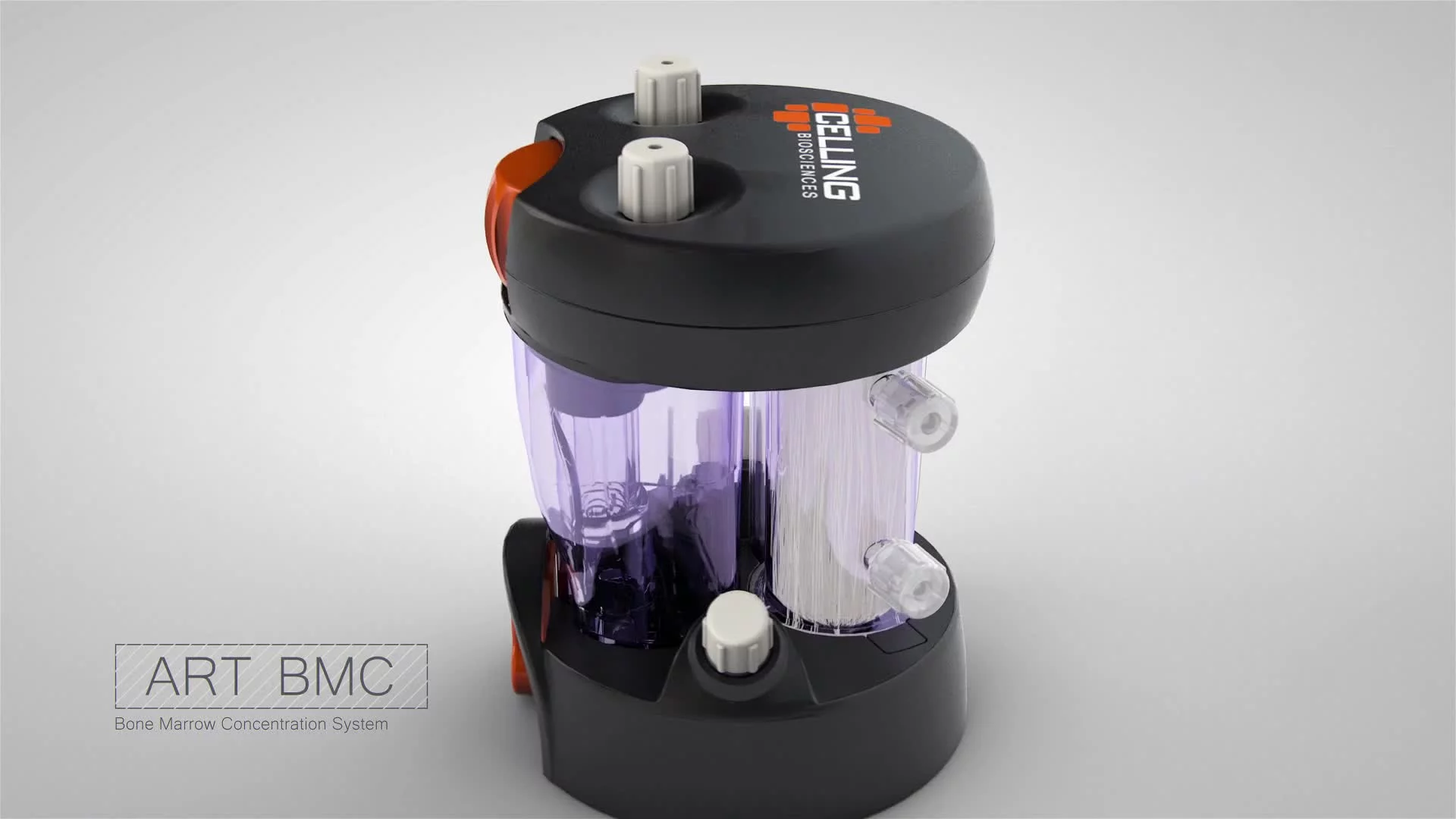
On a system level, tray groups were labeled with high-level categories like “HIP SET” or “KNEE SET,” and stacked tray flyovers included animated infographics to show modular tiers, removable inserts, and sterilization-friendly features. These infographic layers were placed in 3D space, animating with the camera to maintain alignment and reinforce product logic.
These overlay elements weren’t just a final polish layer—they were baked into the storytelling. They made complexity readable, made the product logic feel intuitive, and bridged the gap between marketing and medical. Each one was built with precision and purpose—just like the product they supported.
Final Edits, Brand Compliance & Delivery
As post-production wrapped, we executed a final round of surgical refinements—fine-tuning timing, overlay behavior, and text sync to ensure every visual action lined up with the VO beats. On-screen text callouts were reviewed for crowding and staggered for clarity, especially in dense compositions. Every label was cross-checked against the latest client-supplied nomenclature, with updates deployed through versioned After Effects pre-comps to lock in consistency across scenes.
Brand compliance wasn’t tacked on at the end—it was built in from the start and validated during final polish. Every type treatment, tray color, and overlay behavior was reviewed against TightLine’s standards. RGB values were checked for precision. Bloom strength, drop shadows, and type scaling were all restrained to preserve clinical clarity. Final scenes were compared against the brand’s marketing reference library to guarantee visual alignment between motion assets and static brand collateral.
Final renders followed a color-managed pipeline, with master files exported in H.264 at 1080p—ready for presentations, sales decks, and digital channels. Based on clinical feedback, alternate cuts were also produced, trimming or modifying select overlays for specific audiences without breaking timing or visual logic.
High-res stills weren’t just frame grabs—they were re-rendered from the original Cinema 4D scenes at 8000×4500 resolution using the exact same cameras, lighting, and materials as the animation. No shortcuts, no relighting. Just clean, high-density outputs built for trade show walls, brochures, and keynote slide decks.
The result was a complete visual system—animation and stills built to work together, fully aligned to brand, and ready to perform across digital, print, and surgical education contexts. Every frame told the same story: precise, consistent, and built to the standards the product demanded.
Transcript:
The Exodus revision system is a modular, ergonomic system specifically designed to help reduce your time and frustration in the OR.
Increase your peace of mind before and during surgery that you have the right tools to operate.
Exodus is designed for the job. It’s designed for you.
Instead of cobbling together a makeshift solution with what your hospital or rep are able to provide, everything you need is self-contained in the Exodus Revision system.
Here’s how it works.
Compared to your existing solution, Exodus stacks nicely as one, color-coded system.
The blades are modular so you can make decisions in real time. Every tip is interchangeable with the handles.
With Exodus, whether you’re revising a hip or a knee, you’re only opening one to two sets.
Within the set, you have the flagship handle that allows you to impact and retract the full suite of modular instrument tips.
Using the handle, you’ll be able to transition easily to options that you’ll need for loosening via impaction and retraction, removal by backslapping on the handle, or using the slap hammer. And cement clean-up.
The hip set also has all you need to remove acetabular components.
An adjustable blade reduces the footprint of the tray and still accommodates a variety of cup sizes.
The Handle allows the same impaction and retraction with an integrated torque option with an ergonomic tommy bar. You have contingencies pre-built into the set. There are multiple options for each action.
All of the components work together, so you have multiple methods for approaching each scenario.
They are organized and color-coded for ease of ordering prior to surgery, the ease of scrub techs locating what you need during surgery, and the ease of sanitization and replacement after surgery. Everything has an easily identifiable place so the next time you call for the Exodus set, you can have confidence that you know what you are getting.
A simplified modular and ergonomic system that reduces confusion on the back table and reduces sterilization costs.
Exodus - designed for revisions. Designed for surgeons.