CTest - Equipment renderings
Pre-Production
Project Overview & Visual Objective
The CTest renderings were commissioned to showcase Covenant’s next-generation oilfield equipment within a clean, rigorously engineered testing environment. The primary objective was to create a series of ultra-high-resolution, photorealistic images that communicated Covenant’s operational precision, environmental responsibility, and engineered containment approach—contrasted directly against the messier, risk-prone setups of conventional sites. These renderings were to serve as persuasive tools in technical sales, permitting conversations, and investor-facing presentations, where visual clarity and real-world plausibility were non-negotiable. From the start, the client emphasized the need for visual comparisons that could speak without narration—side-by-side imagery that would make the advantages of the Covenant layout self-evident.
Client Materials & Technical Source Documentation
Before modeling began, we received a comprehensive data package from the client that shaped the entire pre-production phase. This included high-resolution logos, equipment brochures, and detailed documentation of Covenant’s operating procedures. Central to the build was the Best Practices Flow Back And Well Test Flow Diagram (PFD), which illustrated every component and phase of their field operation—from the wellhead through solids separation, pressure management, and production staging. This diagram became the architectural template not only for the visual narrative but also for the spatial relationships between equipment.
In addition to equipment specs, the client supplied field layout references that emphasized strict spacing, flow logic, and regulatory clearances between components. While early diagrams were schematic, the final visuals needed to adhere to the physical constraints and real-world distances of operational frac pads. These constraints dictated clearances between tanks, access paths for vehicles, and compliant placement of flare stacks and pressure units. As pre-production advanced, even small layout decisions—like the orientation of the plug catcher relative to the manifold—were discussed, revised, and approved based on engineering reasoning.
Throughout this phase, we also gathered supplementary environmental references from online research, including visual data from Permian Basin test sites, high-angle rig photography, and industrial pad mapping. These materials informed some of the broader compositional planning, though they were primarily used in post and environment detailing, not modeled directly in this stage.
High-Fidelity Equipment Modeling
Every equipment asset featured in the CTest layout was modeled from scratch in Cinema 4D. This was a non-negotiable requirement given the unique form factors of Covenant’s gear and the absence of CAD files. We approached the asset build modularly—defining each component as an isolated unit with its own topology, UV map, and material hierarchy—ensuring that every element could be flexibly reused, retextured, or repositioned in later stages of the layout or animation process.
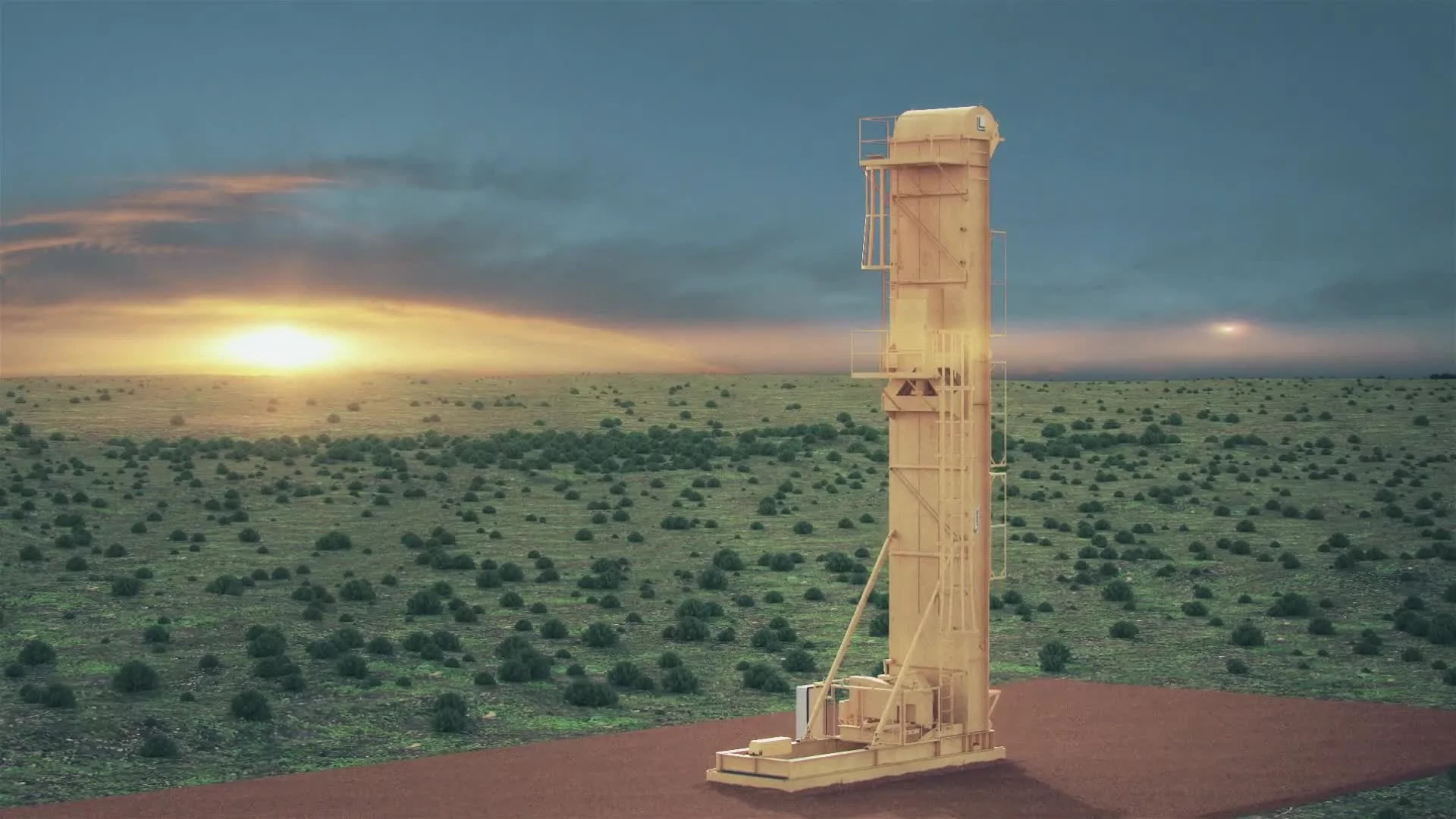
The equipment list was extensive. A total of fourteen primary units were developed in full: the Wellhead, Solids Removal Unit, Plug Catcher, Pressure Control Manifold, High-Volume 1st Stage Separator, 2nd Stage Separator, Enclosed Production Oil Tank, Enclosed Production Water Tank, Enclosed Tank (general containment), Vapor Recovery Unit (VRU), Wellhead Tree, Light Tower, Enclosed Incinerator, and the Manifold–Pressure Control Unit. Each was built using real-world photographic references and technical descriptions from the client’s documentation. Model fidelity was kept intentionally high, with special care taken around inlet/outlet connectors, support frameworks, access ladders, and control panels. These were not ornamental builds—they had to communicate operational realism and withstand scrutiny in high-resolution stills.
Additional props, such as utility trucks and a mobile office trailer, were sourced and customized to match Covenant’s branding. All truck models were retextured and detailed with decals, including logo placement, serial markings, and color correction. These assets supported the scene composition and helped reinforce Covenant’s operational presence across the pad.
Character Creation for Field Realism
To contextualize the equipment and humanize the layout, we modeled and rigged a set of oilfield worker characters, designed to appear actively engaged across the site. A small but diverse pool of five distinct worker types was created—each with slightly different body geometry, hand tools, and task poses. Uniforms were textured in line with Covenant’s brand palette, and normal-mapped fabric details added depth and physicality to the characters in final renderings.
These characters were not placed arbitrarily. They were posed with functional intent—conducting inspections, operating valves, walking between control stations. Their presence supported both visual scale and narrative clarity, illustrating how each piece of equipment was used in practice. As layout iterations progressed, characters were also reposed and repositioned in response to feedback, ensuring every scene remained technically plausible.
Material Development & Surface Logic
All models were UV-unwrapped and assigned physically-based material systems. For Covenant’s core equipment, we developed a clean, high-contrast palette centered on branded orange tones for tanks and separators, tempered by neutral grays and blacks for mechanical elements. Surface roughness, metalness, and AO masks were layered in using procedural shaders to add subtle realism without visually overwhelming the clean branding aesthetic. Where appropriate—such as pressure vessels or separators—materials included embossed paneling, bolt arrays, and heat discoloration masks.
A second texture pipeline was developed later to support a contrast scenario—showing the same site using conventional, uncontained equipment. These alternate versions reused the same core models, but were retextured with desaturated blue tones, and configured to accept grime and damage overlays in post-production. This two-pipeline strategy allowed us to produce both “clean Covenant” and “dirty conventional” layouts without rebuilding geometry, while maximizing flexibility for compositing.
Style Choices & Reasoning
Photorealism was chosen deliberately—not as a visual flourish, but as a credibility strategy. The equipment needed to look real enough to be trusted by operators and regulators, yet clean enough to feel elevated and aspirational. Color choices were tightly aligned with Covenant’s brand identity: vibrant oranges for proprietary systems, contrasted against muted blues for conventional equipment. Lighting was always naturalistic, reinforcing the site’s realism without introducing dramatic or cinematic shadows. Every choice—down to the layout of valves and the roughness of containment pads—was made to create an image that could pass as both a marketing asset and a field planning reference.
Client Feedback & Revision Loop
Client feedback during this stage was frequent and often highly specific. Early discussions focused on flow line color-coding, pipe routing logic, and the visual clarity of separators and containment systems.
As the models were staged into review images, additional structural notes were provided: flare stacks were repositioned, manifolds were swapped with plug catchers, and equipment orientations were flipped to match final engineering diagrams. Shadows under flow lines were removed at client request to maintain visual legibility, and multiple scenes were rendered with mirrored layouts to simulate dual-pad operations.
Later, the client requested a full “dirty” site variant for comparison. This version removed Covenant logos, stripped secondary containments, and retextured equipment in blue. We also developed surface damage overlays and designed a separate grime pass, to be applied later using object buffers and camera data. The contrast was cinematic and strategic—placing both site conditions under identical environmental conditions to emphasize the safety, containment, and visual cleanliness of Covenant’s solution.
Full Production & Post-Production
Production Phase One: High-Resolution Still Rendering
The original scope of the CTest project zeroed in on creating cinematic stills—high-resolution static renderings built for print and technical decks. These weren’t just pretty pictures. They had to be photoreal and technically precise, capturing both the operational flow of the site and Covenant’s commitment to environmental responsibility. From the earliest modeling decisions to final layout tweaks, everything revolved around one core goal: producing clean, detailed stills that balanced engineering accuracy with strong brand storytelling.
Vue Workflow & Environmental Fidelity
We chose Vue as the backbone of this phase for a reason—it’s unmatched when it comes to procedural terrain, ecosystem scattering, and true-to-life daylight simulation. That let us build out expansive, natural-looking environments with speed and precision. Vue’s ability to simulate sun position, atmospheric diffusion, and cloud behavior helped lock in a desert setting that felt both realistic and consistent across every wide-angle frame.
Vue’s terrain tools were critical in establishing a physically believable testing site that could support the scale and realism required by the equipment layout. Terrain was procedurally sculpted using elevation noise functions, then refined manually to support smooth grading where frac pads, containment berms, and access paths would later sit. Vue allowed for layered material blending across the landscape—mixing sandy soils, compacted gravel, and weathered rock through altitude and slope-based masks. This layering produced subtle variations in ground texture without requiring manual UV layout or image-based textures. The result was a terrain surface that held up convincingly in both wide establishing frames and close-in shots near equipment bases. Because these textures responded dynamically to lighting and shadow, the terrain always felt embedded within the larger environment, not floating beneath it—an essential factor in selling realism at print-level resolution.
All models—equipment and characters—originally built and textured in Cinema 4D, were brought into Vue for lighting and final composition. The platform handled high-poly models without breaking a sweat, which meant we could work at full site scale and still nail the placement of pipelines, pads, and gear with pixel-level accuracy. We followed the client’s site layout diagram closely for spatial logic, but Vue is where we really locked in the visuals—everything from tank placement to pipeline shadows was fine-tuned under natural light.
Vue’s daylight system was a standout feature. Instead of manually building lighting setups for every frame, we relied on its physically-based daylight model to control time-of-day, sun angle, and atmosphere. That level of control let us adjust contrast, visual hierarchy, and shadow behavior without ever over-lighting. Environmental zones gave us even more flexibility—vignetting backgrounds, spotlighting certain pads, and keeping the eye where it needed to be.
Vegetation was handled with Vue’s instancing tools, distributing dry shrubs, gravel, and terrain details throughout the scene. These weren’t just filler—they added real-world occlusion and helped ground the equipment, cutting through the sterile CG feel that plagues so many industrial renders.
When the layout was locked, we rendered out stills at extremely high resolutions— from 2K and up to 5100×3300 pixels—for maximum clarity in large-format prints. Each render included multiple passes: color, depth, shadows, ambient occlusion, and object IDs. These became the building blocks for post-processing.
Compositing & Post Effects for Still Imagery
Once rendered, the stills were pulled into After Effects for compositing and brand refinement. Using the EXR passes from Vue, we applied regional sharpening, tone curves, and color grading to shape the final look. Shadows were adjusted with soft masks where needed—especially under pipelines, which the client wanted de-emphasized for clarity.
The “dirty” version of the site involved more intensive post-production, adding contrast and realism through the following enhancements:
Grime layers projected under tanks and separators via tracked geometry
Oil spill masks composited onto the ground using object buffers and camera data
Smoke and fire overlays added to flare stacks using alpha-blended VFX
Cooler color grading to pull saturation from the brand palette
This dual-post workflow—clean versus conventional—was one of the most effective visual strategies on the project. It let us deliver matched camera perspectives across both versions, making it easy for Covenant’s sales and engineering teams to do instant visual comparisons.
Production Phase Two: Late-Stage Animation Expansion
Animation wasn’t originally part of the plan. It came later—after the stills were signed off and the client saw how much impact they had. They asked us to add subtle motion to some scenes to use in presentation videos and interactive tools. Problem was, Vue’s rendering speed made full animation a non-starter. A single frame with lighting and vegetation took hours to render.
So we built a workaround: a hybrid projection method inside Cinema 4D. We used the final Vue renders as base plates and projected them onto simplified proxy geometry, driven by exported camera rigs from Vue. The stand-in models didn’t need full geometry—just enough shape to pull off parallax and camera movement.
This strategy let us add dolly, pan, and crane shots that gave scenes more depth and realism—without re-rendering the full 3D environment. We layered in rack focus, eased camera motion, and subtle shifts in framing to break the static feel and make the shots feel alive.
To push it further, we animated key elements within each shot. Windsocks were driven by cloth simulations, reacting to wind aligned with the sun direction. Their motion was timed with camera moves and composited against the projected backgrounds to create seamless integration.
We rendered the sequences using Cinema 4D’s Physical Renderer to stay visually consistent with the Vue stills. Lighting was baked into the textures, so we didn’t need new GI setups. Multi-pass EXRs gave us flexibility in post.
Post-Production for Animation
Just like the stills, animation renders went into After Effects for compositing. We added dust, haze, smoke, fire, and lens flares to layer in atmospheric motion and soften the CG edges. Because we were working with projected stills, we had full control over texture and lighting fidelity—without paying the rendering cost of dynamic environments.
Object buffers from C4D gave us room to tweak individual elements without having to go back and re-render. We also reused several animation sequences across clean and dirty versions by swapping projection textures and re-linking materials—maximizing value from the same core assets.
Delivery
Still Imagery
High-res stills were delivered as JPEG and TIFF files up to 5100×3300 pixels—ready for brochures, technical proposals, and display printing. Every shot included both the clean Covenant version and the “dirty” comparison. We also produced mirrored versions of some angles to simulate dual-well-pad layouts.
Animation Sequences
Animations were exported at 1080p, 25fps, prepped for video decks and presentations. Each one included post effects like lens flares, atmosphere, and surface wear. Both clean and conventional versions were delivered with matched frame counts for easy editing.
VR Flythrough
A 360° VR experience of the site was created using mirror ball projection and baked terrain geometry. Vue wasn’t fast enough for full-frame animation, so we exported core terrain into C4D and stitched panoramas to simulate a walk-through. Final output was delivered as a spherical video, ready for VR platforms.
Specialized PFD Rendering
One standout asset was a 3D-rendered Process Flow Diagram—built in isometric style but rendered photoreal at print resolution. It served as a bridge between technical and marketing visuals and became a cornerstone of Covenant’s technical collateral.
Before handoff, all final assets were reviewed for brand color compliance, ensuring that Covenant’s orange matched provided references and that all logo placements were rendered at high legibility across multiple resolutions. This level of visual discipline allowed every asset—whether print or animated—to remain consistent, clear, and on-message throughout its lifecycle.