Advanced Ranch Management - the birth of the "Rapid Prototype"
Pre-Production
Concept & Scripting
Imagine you’ve been tasked with building a future-forward system for autonomous land defense—but instead of pitching it like a shiny new product, your job is to make it feel like it’s already out there, running silently in the background, and way above your clearance level. That’s what Advanced Ranch Management set out to create. This wasn’t a flashy brand spot or a traditional explainer video. It was a bottom-up simulation of a complete system—one that could plausibly exist five to ten years from now.
The story was anchored on a remote ranch, where livestock were under nightly threat from predators. But here’s the kicker: the threat was never shown. The entire narrative unfolded through the interaction of sensors, drones, targeting units—all operating autonomously and invisibly.
Writing the “script” looked a lot less like writing and a lot more like designing a system architecture. Each element—mic, case, drone, projectile—was described by its function, not its look. We mapped out decision trees. What happens when a sound is picked up? Where does the signal go? What does the UI need to verify identity? Then we translated all of that into visual moments using 3D animations, graphic inserts, and UI overlays—each synced precisely to its role in the logic chain.
The shape of every object reflected its function. The drone’s smooth curves and concealed rotors weren’t just aesthetic—they told you it was stealthy and fast. The case was blocky and solid to communicate durability and weather resistance. The vertical mic tower screamed “omnidirectional input with minimal interference.” And every UI ping or radar flash wasn’t just a visual flourish—it was pushing the narrative forward without any dialogue.
This was modular storytelling. At any given moment, the viewer should know what the system is doing, to what, and why. So we built a visual grammar: biometric inputs, signal color codes, escalating interface states like “scan,” “track,” and “engage.” A drone launching a projectile wasn’t just action—it was the visible endpoint of a nested logic stack that just happened to look slick.
To ground the interface logic, we took cues from real-life tech—military UIs, drone operation dashboards, gunshot triangulation displays. That influenced everything from signal lag to how data populated on-screen.
The whole piece was built like a covert field test clip—strictly internal, no marketing gloss. No slow-mo hero shots. No glam edits. Just crisp, step-by-step execution proving that the system was real and operational.
Storyboarding & Rapid Prototyping
In this case, storyboarding meant jumping right into a rough 3D build of the entire film. We weren’t chasing polish or surface detail yet—this was all about testing the logic. Did each narrative beat track? Did the mechanics hold up once more layers were added?
We used placeholder geometry for everything. The drone? A flat shape with zero texture. The case? A box with a projected concept image slapped on it. No hinges, no moving parts—just enough geometry to see if drone deployment looked believable in context. The mic tower? Just a cylinder. The projectile? Technically a 3D object. It existed. That’s about it.
The deer blinds weren’t even modeled—they were just 2D images dropped into scenes using 3D tracking data. It let us rough out terrain coverage and flight paths without investing in geometry. Terrain was grayscale heightmaps—noise filters, displacement maps, grid overlays standing in for digital topography.
Drone paths were splines with nulls. Camera moves were dead simple: basic pans, fixed HUD angles, a few framed reveals. No lighting. Simple textures. Just enough contrast to read the scene clearly. The key test: could a viewer follow the chain of logic from trigger to response to resolution?
UI was done in 2D in After Effects and composited onto planes in the 3D scenes. Radars, prompts, biometric overlays—all faked, but in the right places. In some cases, interface planes floated right in front of the lens, locked in Z-space. That way, when we built the final UI, we could just swap layers—no need to re-time anything.
Color coding was already pulling its weight. Red meant threat. Cyan meant scan. White meant standby. No final textures—just grayscale surfaces with ambient occlusion to help legibility. Lighting? One infinite light, strictly for contrast.
By the end, we had a complete RP cut—logical, timed, and visually coherent. Not pretty, but airtight. It ran from first audio detection all the way through final strike and system reset. That cut became the backbone for everything that followed.
Early Visual Styles Explored
While RP was focused on logic and mechanics, we couldn’t help but test a few early ideas on style. Nothing final—just UI projections, device outlines, and layout concepts dropped onto basic meshes. It helped us get a read on how the system might actually feel in finished form.
We stress-tested visual density to find the line where information became noise. How much UI data could we layer before readability broke down? Wireframe passes and depth markers let us stack visuals without bumping up render times or complexity.
We also used this window to figure out timing. When should UI pop in or fade out? How long should it take for a drone to lock a target? These weren’t just animation questions—they were pacing and tone decisions. Was the system calm and methodical or escalating quickly? RP gave us the safe zone to figure that out before locking anything.
Internal Creative Review
From the start, creative reviews became the filter where tone, logic, and interface design got pressure-tested. These were real debates. Should the radar feel like hardened military tech or like something you’d demo at CES? Should targets resemble actual animals, or stay abstract? Would labeling a UI button “DESTROY” come off too intense—or was that exactly the tone we needed?
We also tested how much the viewer could infer without being told. Could they tell when a scan turned into a threat? Was it obvious the drones were autonomous? Sometimes the answer was no. So we added UI states like “awaiting coordinates” or “reacquiring signal” to smooth out the logic chain.
Tone had to do two jobs: look cool and feel plausible. Not “movie real”—real like a prototype DARPA pitch deck. So we stripped out anything ornamental and doubled down on pure system logic. Each round of review pushed us closer to a visual identity that was stripped-down, readable, and quietly threatening.
Alongside creative, we locked in our toolchain. C4D handled all 3D builds—it was fast with nulls, hierarchies, and layout previews. After Effects carried the load for UI motion and final comp. That combo gave us tight control on timing, layout, and post flexibility.
We also set naming conventions and folder structures early. Drones, projectiles, mic towers, UI planes—each lived in modular folders, versioned with timestamps. That way, when the final phase hit, we could hot-swap assets without breaking scenes or timelines.
Top rule? No shaders or lighting until the RP cut was signed off. That gave the UI and comp teams a head start while 3D teams finished out final modeling and materials. We kept logic separate from visual fidelity, which made it easier to move fast and pivot when needed.
Production (Full Production)
Look Development
Once the RP phase locked and the spatial logic held up under scrutiny, we moved into full-scale production—asset construction, texture work, and render-ready scene builds. Gone were the proxy models and placeholders. Every key component was built from scratch, guided by a blend of real-world industrial design references and speculative product logic that made sense in a near-future scenario.
The visual tone stayed grounded. No sci-fi tropes. Every material choice had a function: matte composite polymers, brushed metals, solar-reactive coatings, and rugged, weather-ready enclosures. No artificial grime, no theatrical damage. Instead, realism came through subtle geometry decisions—chamfered edges, offset seams, and just enough surface variance to hint at utility and wear without overstating it.
Lighting was tactical and neutral, not dramatic. We used Cinema 4D’s physical sky and area lights to ensure the products stayed readable across matte surfaces and industrial forms. High-contrast setups were used sparingly and only when needed to support function. The one rule behind all visuals: this needed to look like actual, testable hardware—not something whipped up for a CG showreel.
Design & Animation
The Drone
Final drone modeling started with a cleaned-up version of the RP proxy. From there, we rebuilt it with production-level geometry—symmetrical airframe, recessed rotors, and a sturdy shell inspired by kitbashed industrial components. Every detail had a purpose: intake vents, GPS domes, logical panel breaks, and a targeting unit sculpted as its own functional block. That targeting module, housing the camera and firing system, had a slightly glossier, more metallic surface to cue its sensory role.
The drone gun came together from an array of kitbashed parts—ball joints, rail systems, and ammo reservoirs blended for visual and mechanical logic. It had to feel like something you could manufacture and maintain, not just admire.
Drone animation was path-based and constraint-driven. Acceleration had a delay curve to reflect autonomous but methodical movement. Takeoff sequences included visible thrust buildup and lift stabilization, with programmed reorientation before the drone locked onto a target. Everything was dialed to give off the feeling that this system was efficient and unstoppable.
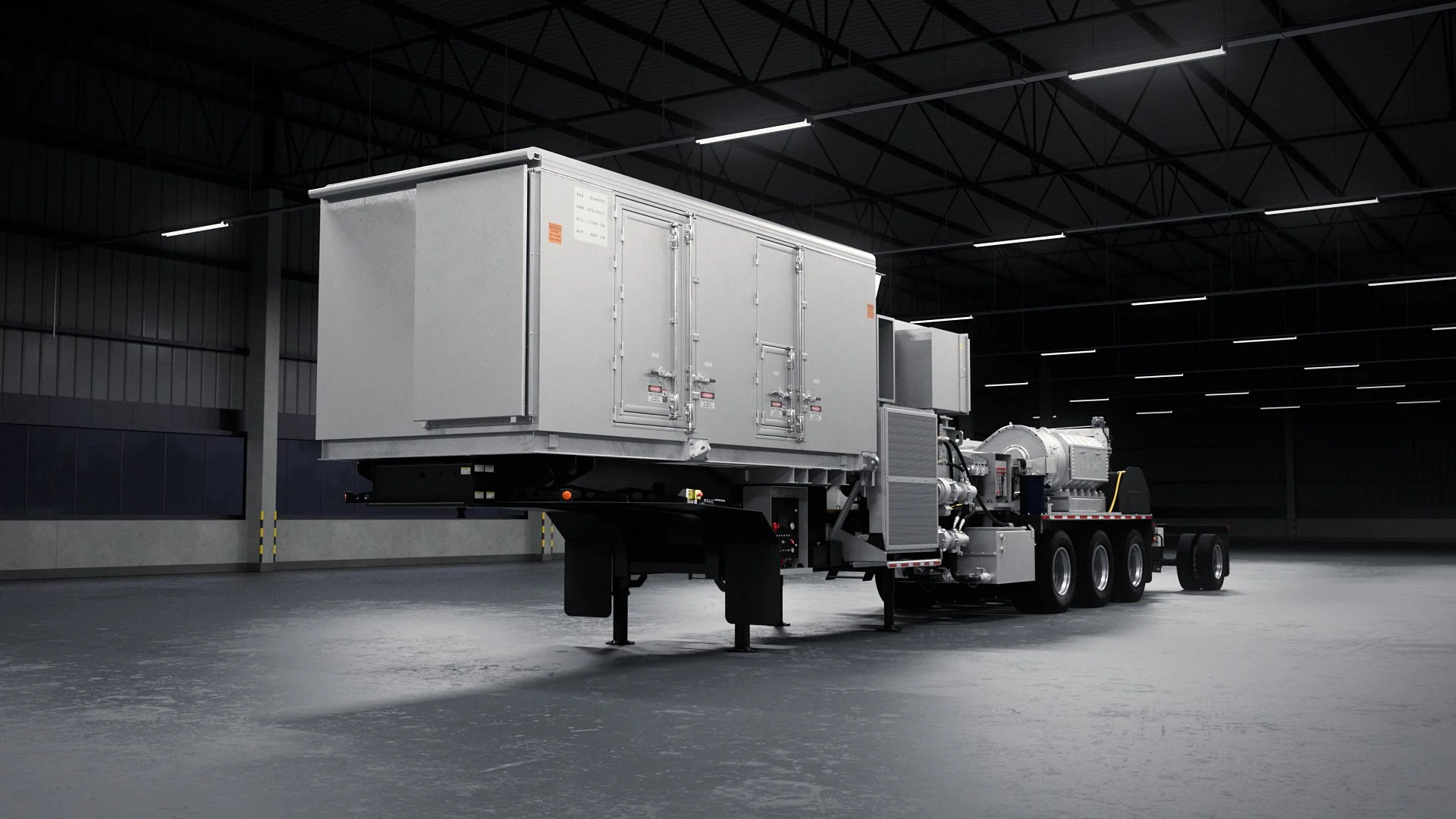
The ARM Case
The ARM case was a heavy lift. It was one of the most iterated, heavily researched assets in the project. Designed from scratch, it came together as a bifold tactical deployment unit. It included an integrated drone dock, solar charging array, and peripheral controls.
We pulled design cues from Pelican cases, hardened military boxes, solar tech hardware, and modular base station layouts. Exterior details included corner bumpers, locking hinges, and magnetic pads for mounting to various surfaces. The solar panels folded out in a two-stage sequence, rigged with hinge constraints and shaded with a layered material stack simulating photovoltaic coatings. You got reflective noise breakup and angle-based color shifts—no fake sci-fi glow, just clean energy logic.
Inside the case was a drone cradle, LED readouts, and a fully modeled control panel. That panel wasn’t faked—it was textured with high-res UI elements made in Photoshop, including ports, backlit keys, toggles, micro-displays, and a working screen display. All icons were geometry-based for close-ups—no flat decals or bump maps.
The rear panel included uplink ports and emergency indicators. This wasn’t just for detail—it gave us an anchor point for certain rotational shots and told the viewer where this unit fit in a broader system. The full case animation included opening, panel deployment, and drone launch, all driven by rigged geometry designed to sell the engineering.
The Microphone Bank
We designed the mic bank to scream omnidirectional sensing. It was a cylindrical tower with spiraled mic ports and a visible logic core. The outer shell included vented layering, metallic guards, and diagnostic indicators. Animation was minimal but purposeful—a slight lift and orientation shift during sound triangulation gave the sense of reactive awareness.
We textured it with a deep matte black and high-contrast specular highlights to keep it legible during long, wide aerial shots. Activation lights and pulses were handled in post.
The Terrain & Projection Mapping Workflow
No procedural shortcuts here. Terrain was sculpted by hand in Cinema 4D, block by block. Every ridge, slope, and valley was shaped for realism and line-of-sight clarity—especially where drone flight or camera sightlines needed to hold up.
We leaned heavily into camera projection for terrain textures. Instead of building high-res UV maps, we projected real canyon images straight from camera views. That got us three things:
Photorealism with Control – Using real photo assets let us dial in believable terrain detail while keeping geometry malleable. Projection ensured pixel-perfect alignment from any given angle.
Render Optimization – Since we only needed one angle per shot, we skipped UV unwrapping and heavy displacement. Scenes stayed light, render times stayed low, and detail stayed sharp where it counted.
Stylistic Flexibility – Multiple projection cameras let us re-wrap the same terrain for different angles, allowing sharp transitions between wide elevation scans and tight tactical moments. The terrain was cloned, reprojected, and redeployed as needed.
Style Choices and Reasoning
Every visual decision was guided by one principle: this had to feel like the real first generation of a functioning defense system. Nothing was added unless it served clarity, plausibility, or narrative function. No bloom. No fake lens flares. No exaggerated wilderness. Everything was clean, mechanical, and intentional.
Camera work followed suit—no handheld motion, no warped lenses. Shots were stabilized, gimbal-style, or drone-tracked. Parallax was used strategically to reveal form or movement paths, not to show off.
We used stillness as a narrative tool. Between key motions, the camera often paused—giving the system time to speak for itself. That silence reinforced the idea that this was a tool in operation, not a spectacle for show.
Technical Details
All 3D modeling was done in Cinema 4D, using subdivision modeling and clean boolean workflows. Texture work combined tileable materials with Photoshop-generated graphics—especially for case UI elements. The majority of materials were created with C4D’s PBR engine and baked down for lighter scenes.
Animation rigs used constraint-based systems, spline motion paths, and orientation tracking. Drone thrust used movement curves tied to null drivers, allowing clean altitude modulation across variable terrain.
Manual terrain meant we had to manage projection artifacts carefully. Even small camera moves could distort textures. We solved it by expanding geometry beyond the frame and locking down FOV ranges to avoid stretch at the edges.
Final renders were 1920x1080, optimized for fast editorial reviews and online use. Every beauty pass came with object buffers and shadow passes, which let us fine-tune shots in post without having to re-render.
Collaboration & Revisions
The modular workflow made collaboration frictionless. Each asset evolved independently but was built to slot into the broader system. Internal feedback focused on function. Could a drone clear its launch arc? Were solar panels in a believable fold-out pattern? Did the control panel feel accessible under stress?
Revisions came fast. The drone started out too small—scaled up by 10%, with the case adjusted to match. The mic tower needed geo clean-up after test renders showed some edge pinching. We re-sculpted terrain more than once to prevent low-angle shots from catching the edge of a texture projection.
Post-Production & Delivery
Final Compositing & Color Grading
Post-production on Advanced Ranch Management is where the build finally turned into a believable product. All the carefully modeled and rendered assets from Full Production came into After Effects for a dense, multi-layered compositing pass. This was more than just interface graphics—it was system logic, user response, diagnostics, audio cues, and biometric feedback layered into every frame. Each shot was restructured and refined to feel like a functioning autonomous system, not a video demo.
Color grading tied it all together. We normalized lighting across daylight and dusk environments using shadow recovery and color curve adjustments. UI overlays were tuned for legibility, even against low-contrast terrain. Highlights like lens flares and pulse glows were added with directional light sweeps and targeted object buffer masks.
Custom lens flares under the drone at launch were built with optical flares and layered glints—subtle, but echoed in follow-up shots to maintain visual continuity and reinforce motion paths.
VFX Enhancements
Beyond flares, the howl detection scene featured acoustic pulses—motion-blurred 3D spheres from Element 3D. These expanded outward with each audio peak, wrapped in radial gradients and glow diffusion. The look was synthetic but grounded—plausible as a machine-vision representation of sound.
Coyote movement came from rotoscoped stock footage. Run cycles were tracked into the 3D environment using nulls and placed behind terrain ridges. Shadows and occlusion locked them into the scene. Despite being 2D, parallax correction and subtle warping projected them into 3D space convincingly.
Projectile launches had practical VFX: sparks, muzzle flashes, blur streaks, and recoil ripples. These weren’t 3D simulations but hand-layered particle assets to keep things fast and stylized. Each impact came with visual feedback—green indicator flashes, pulsing confirmation lights—layered in post for clarity and rhythm.
Infographics, UI Overlays, Data Visualization
The UI system in Advanced Ranch Management was never just visual garnish—it was built to act as a fully functioning data language. Every screen, overlay, animation, and pulse was purpose-driven, designed to reflect the logic, structure, and mechanics of a connected, autonomous product ecosystem in motion. From compositing to interaction design, every UI layer served as proof of a system that could plausibly operate on its own, with clear priorities and tightly integrated diagnostics.
The deer blinds, originally just flat-photo stand-ins in RP, were re-engineered as 3D elements in After Effects using Element 3D. That let them exist in space—casting real shadows, syncing with terrain movement, and anchoring dynamic UI callouts. Each blind functioned as a smart node, with live overlays showing biometric reads, signal strength, sync timing, and system health. Overlays were layered with motion blur and perspective-driven transparency, grounding the data in-camera and making it feel like an augmented output from an actual reconnaissance grid.
Triangulation pulses were rendered in true 3D space using C4D-exported data, visualizing sound detection as a networked convergence of signals across the terrain. Transparent arcs and pulsing wavefronts radiated from each mic bank, timing their convergence into a singular acoustic lock zone. Refracted visuals and staggered pulses gave the sequence a machine-learned logic—calculated, but just organic enough to imply adaptive signal analysis.
During the drone launch sequence, we embedded UI elements directly into the scene. A mini-screen on the case displayed diagnostic data—sync times, load percentages, launch code confirmations. These weren’t decorative inserts—they were timed to exact frame transitions, with light pulses under the drone matching subsequent wide shots, reinforcing both spatial logic and system continuity.
The mobile app UI was among the most deeply developed visual systems in the project. Evolving from a basic wireframe in RP, it became a responsive, multi-state interface designed for real use. Modes like “TRACK” and “DESTROY” didn’t just toggle visuals—they restructured the entire layout. “TRACK” surfaced movement paths, bio telemetry, and real-time GPS tracking. “DESTROY” triggered targeting overlays, projectile readiness indicators, and confidence arcs for strike trajectory.
UI responsiveness extended to the drone’s gun system. Once the drone locked in, a real-time reticle tracked the coyote's movement across terrain. Supporting data—heart rate, velocity, distance—displayed contextually in a modular side panel. The EKG-style heartbeat visualization subtly ramped up as the sequence escalated. This wasn’t flair—it was calibrated tension, using biologically timed UI feedback to raise stakes in a way that felt system-authentic.
The projectile’s UI got its own moment too: a clean, schematic-style readout showing internal diagnostics. The overlay walked through GPS LOCK > PAYLOAD READY > ARMING > LAUNCH with radial progress bars and rotating component highlights. Everything had labels, ID numbers, and small-print details that matched system-wide identifiers across other scenes, creating backend consistency for anyone pausing the video or looking closely.
Topo scenes carried their own data overlays. 3D contour maps were rendered in Cinema 4D and brought into AE for composite layering. Each terrain window flickered, updated, and disappeared with purpose—data pulses behaving like a real networked scan. Grid overlays, elevation tags, and coordinate markers were always grounded to terrain geometry. No random sci-fi visuals here—only what a live geospatial interface might actually show under operational load.
One of the most complex sequences was the mobile app’s armory window. It tracked projectile status live—count remaining, battery charge, antenna signal—all mapped to in-sequence behavior. When the drone fired, the count only dropped after visual confirmation. Signal strength dipped momentarily when terrain occluded the drone’s path. These synced moments gave the software weight. It wasn’t just observing—it was part of the operation.
Everything on screen served the system, not the spectacle. UI overlays anchored objects, mapped intent, and prioritized readability. They guided the viewer’s eye while reinforcing the internal logic of a platform built for performance under pressure.
This wasn’t speculative UI—it was interface design built to imply readiness. Every blinking light, responsive overlay, and dynamic label reinforced the illusion that Advanced Ranch Management wasn’t just a concept. It was already operational.
Final Edits & Delivery
Every layer—flare, line, icon, data point—got color correction tailored to its shot. A consistent high-contrast curve kept terrain readable while separating overlays.
Noise reduction and sharpness were applied to composite passes only—just enough to hold detail without overprocessing. Text overlays were built at high res, then downsampled slightly to kill shimmer and aliasing. Nothing was left at default scale or resolution—each element was placed with intention.
Even though this was speculative, every screen and label followed a locked brand system. Fonts stayed consistent across modules. Label structure followed clear rules: UPPERCASE subheads, bold states, icon-only inputs. The ARM case and mobile app shared icon sets and font weights. Everything—type, iconography, panel layout—was built as if part of a real product family.
From logo to diagnostics, the visual system didn’t just look engineered—it felt manufactured. Real brand discipline, even in a concept piece.
The outro was a 3D animated logo built in Element 3D. Metallic shader, HDR reflections, synced pulse with final system lock. That closing frame brought the narrative full circle—sealed, stable, and locked.
Post was fast and iterative. Early triangulation visuals were too ambiguous—users read them as radar, not acoustics. We redesigned arcs, added sync pulses, and clarified beam behavior. The heart rate overlay was added deep in post when we realized the targeting scene needed emotional tension.
UI contrast had to be rebalanced when dusk scenes caused overlays to blend into the background. We selectively lifted midtones and pulled glow levels down to avoid halos..
Final output was rendered at 1920x1080, optimized for online and presentation formats. We delivered in ProRes 422 HQ and H.264.
Transcript:
Advanced Ranch Management.
The future is now.
Set up at least three cases in high places, like on top of deer blinds. The solar panel charges the battery, which then powers the microphone, processors, GPS, and drone.
The microphones of each of the three cases activate upon hearing the pitch of a coyote howl. They talk to each other to produce a heat map grid based on GPS and topography maps of where and how many coyotes are howling.
Based on the likelihood of mission success, the drones make a decision to launch and arm.
They launch high into the sky, about 400ft above ground level, to the area of the most likely success. After thermal and HD cameras successfully identify a target, they move in. They track the movement of the animal and close in on it. They aim and rapid-fire GPS tracking and poison projectiles until one successfully registers biometric electricity.
The activity and footage is displayed in the user's mobile device, where they can make a decision to destroy or continue tracking.
When destroy is selected, the poison is released, killing the coyote, and GPS sends a final coordinate for carcass collection.