The 8 Ways to Use a 3D Animation in a Sales Presentation
Pre-Production
Concept & Scripting
This internally commissioned 3D animation was built to break down and bring to life a core sales enablement framework: eight strategic ways a 3D video can work inside a sales presentation. Instead of leaving each tactic as a vague category, the creative strategy was to physically embody every archetype—smart, cinematic constructs engineered with precision inside a conceptual space. The eight types—Pre-Read, Tell-It-All, Background Video, Hook, Middle Stuff, Reuse, Supporting Point, and Didya Know—weren’t just talked about. They were made tangible, mechanical, and easy to remember.
The script was crafted to follow the rhythm of an effective presentation. Each part stood on its own, designed to hit the right tone, pace, and level of clarity. Internally, we aligned on the script’s role: to match and complement a companion eBook, with each use case mirrored by a matching icon. These icons—created in Illustrator by our in-house designer—weren’t afterthoughts. They were baked into the visual DNA of the project from day one. Because they were clear and purposeful, they pulled double duty: guiding navigation, transitioning scenes, and becoming physical animation elements.
Script and visuals were locked together from the jump. Early ideas included transforming each icon into a 3D object — something that could move, roll, or shift physically within its world. But early feedback made it clear: static morphs might look clean, but over longer voiceovers, they risked falling flat. That insight shaped the motion game plan. Instead of abstract transitions, we leaned into physics, mechanical logic, and metaphors that had weight. That’s how we landed the visual tone: tactile, conceptual, and semi-photoreal.
Rapid Prototyping (RP)
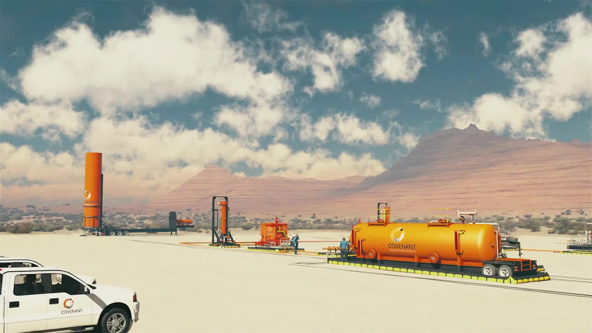
The RP phase covered over ten layout and shot experiments. Built out in Cinema 4D, these scenes used basic geometry and clay shaders to block in motion and test the physics. One of the first big environments introduced a large “8” inflated using cloth simulation, anchored with rope constraints. This opening shot set the tone: design thinking meets material logic.
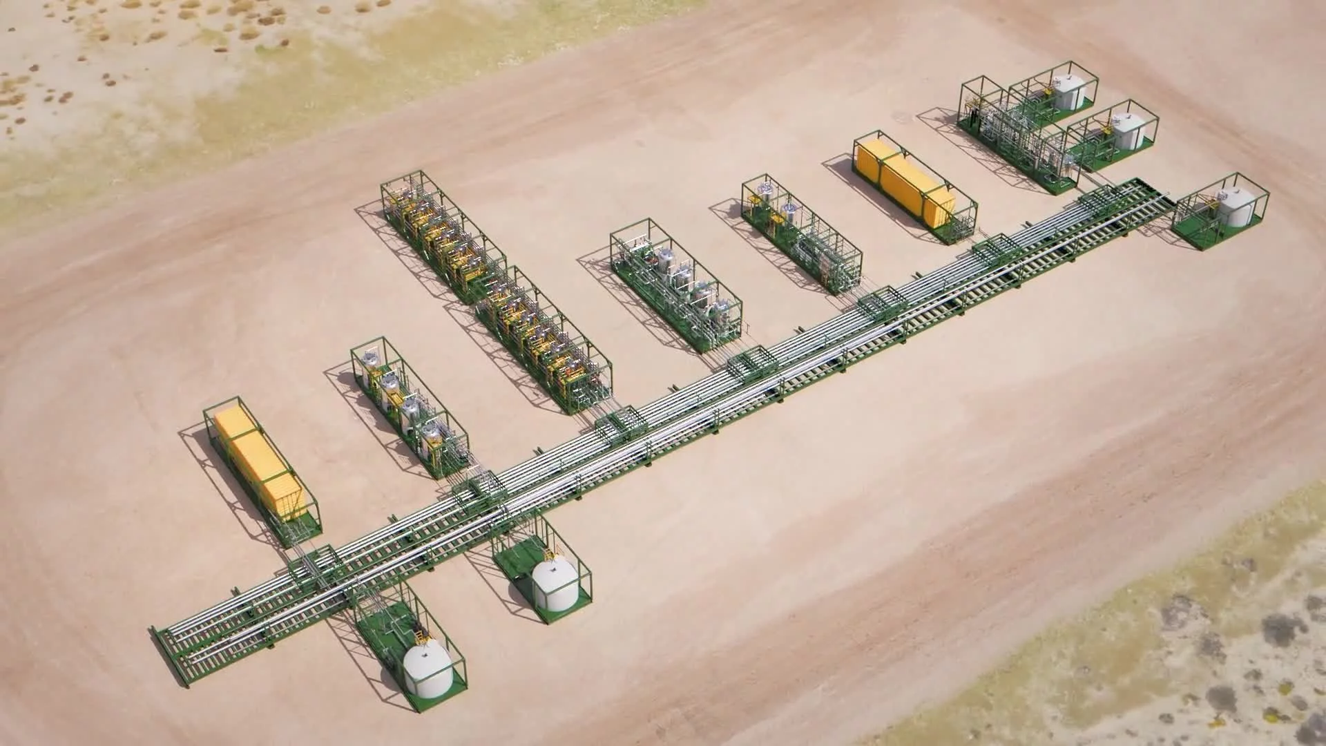
In the same space, wooden planks stacked with real collision physics to form a structural base. Metallic icon cylinders—modeled from 2D vectors—were dropped into slotted wooden wheels. These wheels rotated and sent the icons gliding down curved rails embedded into the floor. Each icon responded with bounce, friction, and final placement. Underneath, the cables gave the impression that these systems were powered—quietly—by motors below the surface. Every piece interacted with gravity and surface detail, grounding the entire concept in believable physics.
A standout RP test built the “Background Video” set as a floorplan spelling out “B” and “G” in walls. Mounted video screens played actual past work from the team. Another use case—number seven—took the form of suspended blocks that, when viewed from the right angle, visually resolved into the number “7.” These types of perceptual reveals added depth to the storytelling mechanics.
For “Reuse” and “Didya Know,” we leaned into spatial metaphors: wooden walls, metal frames, and flexible video screens. These digital stand-ins moved between walls and tables, even wrapping corners—suggesting platform flexibility and content reusability. Animating those sequences meant simulating how real surfaces bend and move inside a structured grid. Even with abstraction, every element had to feel like it could be built, bolted, or mounted in real life.
RP scenes were rendered in a single clay shader—uniform gray, no textures. But lighting was already near-final. We built out real directional and area lights to mimic studio setups, test shadows, and establish mood. That way, the focus stayed on layout, motion flow, and camera work—without the visual noise.
Motion was a core part of the language. Every camera move was intentional—slow dolly ins, parallax reveals, clean pans, and zooms. All timed with voiceover beats and presentation rhythm. The camera wasn’t passive—it was a storytelling device built to control viewer focus and amplify tone.
Early Visual Styles Explored
Early styleframes and animation samples tested a range of render options, from flat lighting to high-falloff, glossy surfaces. It became clear fast: tactile realism was the way to go. The visual tone landed on a semi-photoreal look—stylized but deeply material. This gave us freedom to build imaginative spaces while still grounding each interaction in believable surface behavior.
Typography and layout were prototyped during this phase, too. We tested several font styles against evolving 3D scenes. The final pick? A geometric sans-serif—clean, modern, and fully integrated into the 3D environment. Text was anchored in-world, lit with the same systems, and treated with glows and shadows to reinforce spatial depth.
The icons evolved from 2D UI markers to full-on physical objects: metallic-rimmed disks with embossed graphics. These weren’t static—they rolled, locked into place, dropped into chambers. Each animation sequence was governed by the physics of the scene—ramp angles, weight, friction. That realism gave the entire video its grounded, cinematic feel.
Prototyping Animation Concepts
Animation strategy stayed tightly focused on believable interaction. Not hyper-real—but realistic enough to feel right inside this stylized world. Icon movement was built with Cinema 4D’s rigid body engine, dialed in with specific bounce, damping, and weight values per object. Rope and cloth elements were handled with soft body sims. Camera rigs followed constrained paths—like rails in a gallery space—allowing for precise tracking and pivots.
For screens that shifted between walls and tables, motion was guided along invisible splines, with bending animated via deformers. This created the illusion of digital material wrapping around hard edges. These touches reinforced the core concept: a sales video that flexes across platforms.
Lighting setups were tested and refined constantly. Scenes combined keyed lights, bounce light, and soft diffusers to create depth. The result was a cinematic tone that carried all the way through production.
Client Feedback Shaping Direction
Even though this was built internally, we ran feedback like a client project. Dozens of small, strategic decisions were made based on team input. Daily reviews shaped the visual and motion direction.
One major pivot came when we realized icon morphs lacked visual tension. That led to the switch: full physics-based icon motion using real dynamics.
Another key takeaway? Lighting had to be tuned per scene. We scrapped global lighting rigs in favor of building scene-specific setups for each shot. That change alone pushed the visual quality forward.
Style Choices and Reasoning
The semiphotorealistic conceptual style was a strategic decision. First, it projected craftsmanship—polished wood grain, realistic metals, cloth motion, and clean cinematic framing. Second, it unlocked creative freedom: walls could spell letters, screens could bend, icons could drop through rails—without anything feeling out of place.
More than just a visual choice, it created a metaphor for storytelling. Every scene looked like a futuristic sales gallery—not pushing product, but explaining how to sell through smart animation. It was a loop: a 3D video, showing how to use 3D video, in the same language a client might want for their own message.
Every detail—every surface, camera move, icon drop—was tuned to drive home one message: good animation isn’t just beautiful. It’s built to be smart, flexible, and designed to work in real sales conversations.
Production (Full Production / FP)
Look Development
As Rapid Prototyping wrapped, we moved into Full Production with one clear goal: level up every shot into a fully rendered, visually intentional cinematic sequence. That started with deep material and shader development. Every asset—structural or symbolic—was treated with physically based rendering (PBR) logic, ensuring real-world light response. V-Ray was the engine of choice for its accuracy in lighting simulation, strong GI controls, and seamless Cinema 4D integration.
Materials weren’t just applied—they were crafted. Wood surfaces got layered grain maps, slight gloss variance, and low-frequency bump to suggest hand-finished quality. Concrete featured micro-cracks, fine-grain roughness, and varied specular response. Brushed aluminum had anisotropic highlights and abrasion noise to reflect light directionally. Transparent objects like icon sleeves or edge-lit glass used multi-layer shaders—combining reflection, transmission, and controlled edge glow—for a tech-display feel.
Even minor elements got detailed attention. Digital panels that slid around corners weren’t rigid—they were simulated flex surfaces, textured with glass-like shaders and layered with glow-based UI elements. We used tone-mapped emissives to make screens glow without overexposing the shot. For fabric elements—like the inflatable “8”—we added subsurface scattering and translucency to nail the way light interacts with backlit textiles. Ropes got braided normal maps and realistic cloth sheen to feel physically tied and weight-bearing.
Lighting was built per shot—no templates reused. Each frame had its own lighting design, with directional key lights, bounce fill, soft volumetrics, and object-level accents. Key lights brought out surface character without flattening detail. Light falloff was tuned to ensure contrast and separation—especially where dark-on-dark materials met. Reflections played a supporting role, letting metal surfaces pick up glints from UI panels or nearby objects for subtle interplay.
Final look dev required test renders of every single scene. No batch rendering happened until each one was approved. We reviewed everything—composition, lighting balance, depth of field, texture interaction under motion blur. The bar was set during RP, and now every frame had to match it—or beat it.
Design & Animation
In Full Production, animation moved from layout to architecture. Scenes weren’t just visual—they were engineered. Every piece of motion had purpose. Every layout told part of the story.
Take the inflated “8.” It wasn’t just metaphor—it was engineered cloth sim, with dynamic rope constraints reacting to force and collision. Anchor points were manually keyed to mimic rope tension. The base had to settle naturally against a floor grid, so we used surface collision and minor jiggle deformers to suggest internal air pressure.
Icon movement became a signature element. Each metallic cylinder was tuned for weight, bounce, and drag. When dropped, rolled, or slotted into trays, it had to move with precision. Friction curves were dialed in to bring each icon to a perfect stop at the mark. Floor-mounted wheels had custom notches to accept icons with realistic collisions—springs, dampers, inertia all working behind the scenes to get the feel just right. Depending on complexity, scenes used either soft or rigid body sims for realism.
Environment motion had the same logic. In the “Reuse” section, digital shelving built from wood and anodized steel unfolded with the precision of high-end hardware. Hinges, sliders, and motion constraints made it feel real—like something you could build and use. Digital displays bent from wall to table using spline paths, IK constraints, and speed curves that matched the form factor’s shape and corner logic.
The “Didya Know” scene played out like a platform demo. A screen emerged from behind a wood panel, curved around a 90° turn, and extended into view. Rail splines, bend deformers, and control nulls managed speed and rotation in sync. Normal correction kept lighting realistic through every twist and transition.
In the “BG” architecture scene, perspective did the work. The structure looked random from eye level—but when the camera pulled back and up, it resolved into clean “B” and “G” forms. This relied on forced perspective and a tightly timed camera path. As soon as the letterforms read clearly, the scene broke apart dynamically.
Scene “7” added complexity. Dozens of blocks hung from cables, aligning into a perfect “7” only when viewed from one angle. The animation used a camera pivot timed to reveal the number, then passed through to break the shape. Wire rigs were simulated; block placement followed a null-based system to nail perfect type at just one frame.
Cameras were as choreographed as the objects. Every dolly, orbit, and push was mapped to draw viewer attention without distraction. Motion blur was tuned to cinematic levels—enough to feel natural, but never enough to lose clarity on icons or UI detail.
Style Choices and Reasoning
The semiphotoreal conceptual look carried the whole project. It let us stretch—icons as metaphors, walls that spell letters—while keeping the physics grounded. Material realism, weighted motion, and consistent lighting made even abstract elements feel real. That was the point: to show how animation can explain the abstract in a way that’s believable, useful, and memorable.
Every element supported the core message: this is how you use 3D to explain big ideas. By treating surfaces with care, building motion from logic, and designing every camera move, we delivered on the pitch. The animation wasn’t just a sample—it was a live demo of how smart, strategic motion design connects to sales.
Technical Details
Production ran entirely in Cinema 4D with V-Ray as the render engine. Materials were authored using V-Ray’s node system, built from physical IOR values and stacked roughness layers. Texture maps—diffuse, bump, gloss, displacement—were created either procedurally or with high-res scans. Scenes were optimized using render layers, object visibility toggles, and asset instancing. Final rendering used full-frame AA with adaptive DMC sampling.
Simulations included cloth (for fabric forms), rope dynamics (for cables and tethers), rigid body systems (for icon interactions), and spline-driven paths (for curved screens). Light rigs followed key/fill/rim setups, with HDRIs used for ambient bounce. GI was set to brute-force + light cache—giving us the quality and render speed we needed.
We exported motion passes with object buffers and full 3D data for compositing. Depth and ID mattes were baked per frame to support DOF and selective grade control.
Challenges and Solutions
Biggest challenge: making physical realism work inside abstract scenes. We solved it with simulation-first planning. Every major move was built on real-world physics—then tuned with constraints, dampers, and logic.
Rendering large sets with layered emissives was another hurdle. We used asset instancing, GI overrides, and pass-based rendering to keep iteration fast. Lighting and emissive elements were separated for better control in post.
Finally, balancing realism and conceptual abstraction took constant coordination. Every frame had to look like a physical space designed to communicate an idea. That was the standard—and we held to it every step of the way.
Post-Production & Delivery
Final Compositing & Color Grading
Post-production was about dialing everything in. Renders were delivered with full multi-pass exports: depth, object buffers, ID masks, motion vectors, and world position data. That gave us surgical control in post—every effect was adjustable without needing to touch base layers again.
Compositing happened in After Effects, using a structured, layered system. Each shot was broken into clean stacks: background plates, object interaction layers, UI overlays, glows, enhanced motion blur, and final grading. Matte passes gave us tight masking control to isolate foreground tweaks. Blending modes added micro-luminance shifts across materials—especially useful for working emissive UI panels into dark backgrounds without crushing edge clarity.
Color correction leaned into a cinematic mindset. Curves, levels, and exposure were used to enhance contrast with smooth shadow rolloff and soft highlight transitions. UI elements (especially blues and oranges) were bumped slightly for saturation, while midtones across steel and concrete were cooled just enough for tonal consistency. Everything pointed toward clarity—no piece of the frame was allowed to dominate the hierarchy.
Sharpening was subtle. Grain was added gently to fight digital flatness, especially in wide shots where texture depth matters.
Lens effects were functional, not decorative. Chromatic aberration hit the screen corners lightly for realism. Vignette and distortion were added shot-by-shot to reinforce depth and focus. In moments like the flexible panels or the number “7” scene, edge bloom and faint lens grime added just enough imperfection to make it feel physical.
DOF was implemented with V-Ray Z-depth and After Effects blur plugins, controlled by world position data for smooth focus pulls. This was key in shots where icons approached the camera or structures resolved out of blur..
Lens flares were controlled and placed with precision—always sourced from real light positions like UI panels or spotlight edges. No flare broke the visual integrity. Luminance triggers and lens shape settings ensured flares added life without mess.
Infographics, UI Overlays, Data Visualization
UI overlays were core to the design. Built to feel physically embedded, every overlay tracked to 3D camera data from Cinema 4D. That gave us live parallax, occlusion, and proper placement within the scene space.
In segments like “Reuse” and “Didya Know,” overlays weren’t just screen graphics—they bent and flexed with the digital displays. Radial infographics and wireframes followed the curvature of the panels, using comp-space warping and null-linked displacement to nail placement.
Typography matched the 3D signage, but in 2D it had glow and transparency to differentiate as digital. Timing was synced tightly to the VO cadence and scene action—every overlay appeared and faded out on the beat.
Brand Consistency
Every post step stayed locked to brand. Deep navy, orange accents, grayscale balance—check. Typography held across signage, UI, and all overlays. Even emissive glow color was tuned to match the brand: white, with just enough orange warmth to feel intentional.
Icons were kept true to the Illustrator designs. Their 3D versions preserved proportions, hierarchy, and edge precision. During color grading, frames were cross-checked against brand swatches for tone compliance.
Final framing respected 16:9 safety zones. Text and icons were fully visible across all delivery platforms—from desktops to conference room screens.
Delivery
Final delivery was in full HD (1080p), encoded in H.264 for clean playback and fast distribution. Alongside the master video, we delivered eight standalone cuts—one per video archetype—for modular use across sales channels.
Those individual cuts gave the project flexibility—usable in trade shows, client decks, social media, and internal training. The modular strategy mirrored the modular script. This wasn’t just a video—it was a toolkit. Captions were added based on script segmentation.
End result: a cinematic, technically sharp, strategically modular video that didn’t just showcase the framework—it was the framework in action.
Transcript:
Presenting the 8 ways to use a 3D video in a sales presentation.
The pre-read. The Tell-it-all. The background video. The hook. The middle stuff. The reuse. The supporting point. The didya know.
In our years of doing sales videos, every video falls into these one of these 8 archetypes. The one that is right for you to win your presentation depends on your structure, the presenter and your audience.
The pre-read. A pre-read can be your most effective tool in sales. It allows your audience the opportunity to come to your presentation prepared. It makes you look prepared. And it allows you to use your time establishing a relationship.
The tell-it-all. Most videos we do end up as a tell-it-all because of their versatility. They can completely stand on their own. On a website, in an online data room, as a presentation opening, as a middle. They are impressive and consistent. They tell your story the same way, every time.
The background video. These are mostly used for trade shows, played on a loop on the inside of the booth. They attract attention, allow the presenter to reference them and they don’t dominate the presenter. They let sales people sell.
The hook. The classic cold open. It will set the tone for the meeting exactly as rehearsed, every time. Plan to use this as an introduction before you even say a word. These are great for a presentation with an audience larger than 7.
The middle stuff. Sometimes you need the what and how explained succinctly and well. You need a tool that explains “the middle stuff.” The stuff that comes after the why and before the questions. P.S. a lot of pre-reads could also be middle stuffs. In the film industry, this is also called Act II because it’s the time of the character’s struggles. Just saying.
The reuse. This is a sales video that someone pulls from the website or the marketing folder that explains one thing really well. Or the salesperson knows that it’ll impress the prospect.
The supporting point. Sometimes there’s just one thing that you have a hard time explaining. It’s an important point. Something that is crucial to know. But it’s not the crux of the presentation. These are the supporting point videos. It’s typically a good exclamation point to an already good presentation. “Wow if they spent so much time and energy on this point, it must be important.”
The didya know. The didya know is intended to pique the interest and broaden the perspective of your buyer. And isn’t that the point? To help them see how you can help.
The pre-read, the tell-it-all, the background, the hook, the middle stuff, the reuse, the supporting point, the didya know. The 8 ways to use a 3D video in a sales presentation. Which is right for you?