RLL Protect (Alternative to renters insurance)
Pre-Production
Concept & Scripting
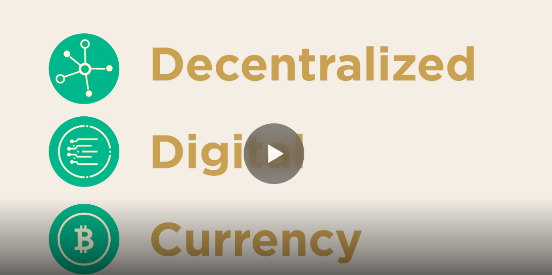
RLL Protect started with a single, straightforward challenge: explain an alternative to traditional renters insurance—technically known as HO-4 coverage—in a way that feels trustworthy, clear, and easy to engage with. From day one, we stripped out the usual friction found in insurance messaging. No legalese, no dry policy talk—just a clean, warm narrative with a touch of light humor. The script was built to answer three key questions: what is renters insurance, what coverage actually matters, and how does RLL Protect deliver all of that without the hassle?
The client made one thing especially clear: we had to emphasize that RLL Protect provides the same core protections—especially the $100,000 benchmark—without the red tape. That meant spelling out coverage for fire, theft, liability, legal defense, and medical payments, all with no application required. These elements were hardwired into the script to match the client’s sales positioning. Every line was written to be direct without being dull, breaking down legal concepts into simple, relatable metaphors. Visually, the script was structured to support smooth icon transitions and symbol-based storytelling, all leading to a clear call-to-action: visit RLLProtect.com.
Rapid Prototyping (RP)
We kicked off Rapid Prototyping with a design in Illustrator, building an initial library of line-based icons and entire frames. Each was designed for trim-path animation—clean strokes that animate in with fluid reveals. We dropped those icons into After Effects, paired them with temp voice-over, and roughed out the sequence. The core motion logic was simple: a single animated stroke that weaves through the story as a visual and narrative connector.
Twelve icons were created to represent specific covered perils. Each was individually animated and optimized for legibility—even on small screens. We broke out each script phrase into its own layer, syncing them tightly to the voice-over. Early tests played with stroke weights and fill behaviors, pushing the limits of complexity without losing clarity. We tried overlapping transitions between icons but cut them after testing—they distracted more than they helped. Instead, we added subtle effects during slower beats to keep the energy up without cluttering the design.
Early Visual Styles Explored
At the start, we explored three different directions: a whiteboard sketch style, a flat vector approach, and a textured-paper look with hand-drawn-style iconography. The third option was the clear winner. It struck the right balance between professional polish and visual warmth. The client gravitated toward its tactile feel and how well it played on digital screens.
To support this direction, we layered a soft paper texture over a deep blue background. The palette—blue, white, yellow, and green—was kept tight for brand consistency and on-screen clarity. We stayed away from gradients and shadows to maintain a minimalist, modern look. All icons were built digitally but styled to feel hand-drawn—delivering crisp visuals with a crafted edge.
Prototyping Animation Concepts
The animation centered around a single continuous stroke—a line that moved through the entire spot, connecting visuals like a sentence. Each icon, whether an umbrella or a shield, a contract or a stack of cash, was formed along this path. Using After Effects’ trim-path tools, we choreographed each sequence to build on the one before it, aligning perfectly with the voice-over and the brand’s simplicity-first message.
We spent time fine-tuning motion blur and easing curves to keep everything fluid and clean. While we considered mixing up the stroke weight for emphasis, a consistent line weight won out for clarity. To keep things moving, we layered in small spark and flicker moments to accentuate key beats—just enough movement to keep eyes on screen without overdoing it.
Client Feedback Shaping Direction
Client input helped shape the direction early and often. One of the first notes was on the padlock icon—it came off too harsh, almost like a jail cell. We softened the shape to something friendlier and more approachable. They also asked us to bring the visuals closer to their internal decks, which led to a redesign of several icons for better brand alignment. They wanted specific coverages—fire, burglary, legal defense, medical payments—called out more clearly, so we reworked the script to push those forward.
Another key ask was cutting down on on-screen text. We rebuilt scenes so that phrases came in exactly when spoken, managing each one on its own layer to avoid information overload. The final CTA—RLLProtect.com—was given more weight visually and narratively, with a direct sign-up visual to support conversions.
Style Choices and Reasoning
We went with 2D motion graphics because it’s the most efficient way to break down complex ideas fast. Line animation gives you natural progression and flow—perfect for walking viewers through abstract topics like insurance. We skipped realism and leaned into stylized shapes and sequences that build understanding frame by frame.
We used color accents—yellow and green—strategically, only where they helped highlight a benefit or action. The textured pen-style strokes gave the icons a human, relatable touch—something that stood out against more sterile corporate explainer videos. Every decision—design, animation, color—was built around clarity, simplicity, and trust. The end result was a visual story that made renters insurance feel straightforward, protective, and friction-free.
Production & Post-Production
Full Production: Animation Execution & Visual Refinement
Once the prototype was approved, we moved into full production by importing finalized Illustrator assets into After Effects. Every element—icons, UI shapes, and text—was converted into native shape layers, giving us full control via trim path animation. This let us dial in precise line reveals, adjust speed dynamically, and maintain vector sharpness across formats—critical for mobile and web clarity.
The animation followed the same core logic established in prototyping: a single animated line drawing and linking scenes together. In production, this motif became even more intentional. Icons emerged from the same stroke that had formed previous ones, creating seamless transitions and a continuous visual thread. Stroke thickness was standardized, locking in the aesthetic we refined during earlier testing.
All twelve RLL Protect coverage perils—fire, burglary, vandalism, hail, water damage, and others—were brought to life with animated icons. Each included looping micro-movements: flames flickered, hail fell, books toppled. These weren’t just decorative—they added subtle motion that kept things engaging without breaking the clean, minimal style.
Typography was animated separately, line by line. Text entries were synced with voice-over beats using scale pops, opacity fades, and bounce timing. We introduced each phrase in staggered layers—never overwhelming the viewer, always pacing the content. These animations weren’t fluff; they reinforced spoken content and gave the video its rhythm.
The background used a paper-textured overlay applied with blend modes, softening the deep blue negative space and giving it tactile warmth. Earlier versions with flat color felt too clinical—this texture brought depth without losing clarity. Brand colors—dark blue, white, yellow, green—were kept tight to RLL's identity, and we avoided gradients or drop shadows to stick with the flat design approach.
Post-Production: Motion Polish, Effects & Delivery
After the core animation was complete, we moved into post-production to polish motion and enhance visual energy. We added a full secondary pass—sparkles, light accents, and trailing effects were layered in to punctuate key transitions and hold viewer focus. Line movements were adjusted with arcing paths and eased acceleration to create a more organic flow.
One of the standout effects was subtle turbulence displacement. This was applied across the comp to gently disrupt the mechanical precision of vector lines, giving the piece a more human, analog feel. It worked especially well in a project where warmth and simplicity were key.
No element was left untouched. Even icons like the legal contract had layered reveals, with individual line segments animating in rhythm. The final CTA scene featured a cursor clicking the “Sign Up” button—complete with scale pulsing and ripple feedback to simulate interactivity. These touches helped build trust and reinforced the message without veering into UI overload.
Sound design was added in Premiere Pro. Light effects—like line draws, icon reveals, and cursor clicks—were matched with subtle audio cues. These were supportive, not showy, keeping the focus on narration but giving each beat a bit more presence.
Color grading wrapped things up. We tested both white and dark blue backdrops in final comp. While white was clean, it lacked brand weight. The blue was richer, better aligned with RLL’s identity, and held contrast better. We fine-tuned accent tones and ensured all colors hit the right balance for clarity, saturation, and accessibility.
The final frame showcased a simplified mobile UI with a clear “Sign Up” button, holding just long enough to invite action. A final spark punctuated the ending, and the RLLProtect.com URL stayed on screen to support recall and conversions.
Final Output
The finished animation was rendered in 1080p H.264, ready for web deployment. The final comp included all narration, iconography, motion logic, and timing built into one seamless deliverable. No alternate cuts or formats were specified, so we delivered a single, polished brand explainer designed for maximum clarity, credibility, and conversion.
Transcript:
RLL Protect is your most convenient solution for renters insurance.
Why do you need renters insurance?
One. Protect your belongings.
Your personal property is covered from Fire, Burglary, Vandalism, and more and you can add optional property coverages for perils such as accidental water backup and pet damage.
Two. Its liability coverage protecting you in the event of negligent bodily injury or damage that you may cause to someone else’s property.
It could include the kinds of costs you never really think about.
Three. It’s a requirement!
You are required to have personal liability coverage of up to $100,000 according to the terms in your lease.
Protect yourself.
Sign up for RLL Protect today.